Monday, September 30, 2013

Digital Graveyard: Covers And Artwork For Genetic Disorder Magazine, Part 3

(Click most images for bigger versions)

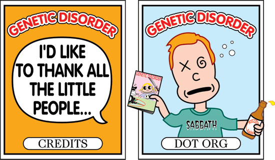
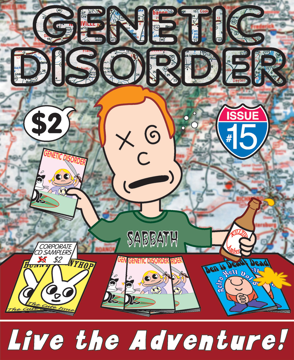
After Genetic Disorder #14, the Satanic theme issue, followed by #15, the single-story tour diary, Larry returned to a grab-bag approach in issue #16 in 1999, and the issue featured a variety of articles on a wide range of topics. Also, the size was changed yet again, to classic comic book proportions, so I decided that the "Tales From the Crypt" approach, with circles down one side, was a good way to get a lot of information about the contents onto the front cover. Other than that, I'd say my primary two influences on this project were Sanrio and Garbage Pail Kids.

Larry and I had a great working method: he would give me an envelope filled with all the finished articles from the upcoming issue, as well as descriptions of unfinished pieces, so I always got to read most of the contents for inspiration. Larry always surprised me by pretty much letting me do whatever I wanted. I was especially surprised that he liked this totally slick/girly/cartoony approach in pastel colors, which is so totally opposite to the gritty contents of the magazine.

This time I knew what I was doing, and as a result, the magazine as printed looks exactly like the image above. For the first time, I made absolutely everything a vector image, so nothing had to be left to chance.

The central figure, Li'l Kunty™, is this time displaying her parasitic twin. She has nothing whatsoever to do with the contents of the magazine, other than by using her three issues in a row, she had become something of a mascot. Mostly I just loved the idea of a really cute cartoon character having such a drastic abnormality. Here's the rough version, done in graphite, Prismacolor, and gouache:


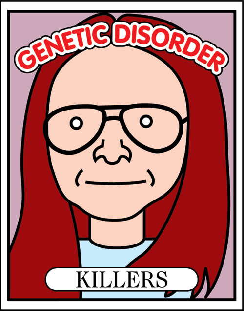
For the back cover, I was able to feature more of the magazine's contents by presenting them as fake trading cards:


That was a lot of work! I had a couple of alternatives and early ideas that didn't make the cut, like these:


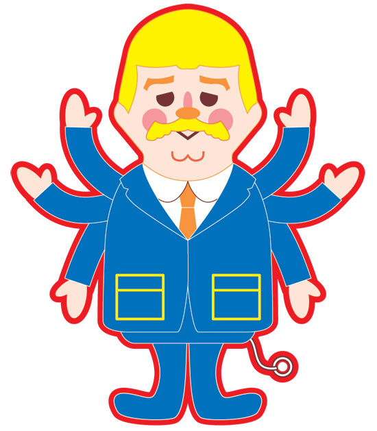
And this, a cartoon version of the infamous Brenda "I don't like Mondays" Spencer:


Brenda got bumped in favor of Gary Heidnik. I'm not sure why! Drawing Heidnik was a real challenge, because I suck at likenesses, and because it was hard to make it realistic enough to look like him, but still cartoony enough to fit in with the rest of the illustrations. This is the photo I used for reference:


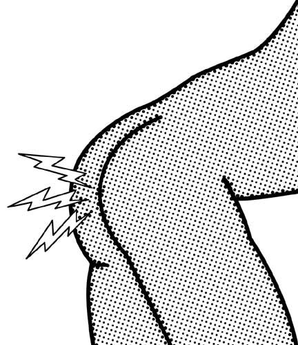
I also did an illustration for the inside of the magazine, for the "Cursed Ass" story promised on the front cover:


I remember Larry's reaction to that one was, "Ha, ha. that looks like porn," to which I probably responded by changing the subject.

And finally, for the inside front cover, to advertise myself, I chose this image, a drawing I did as a study for a painting:


Have you accepted Talking Captain Kangaroo Doll as your personal savior?

Next up: Genetic Disorder #17... in 3D!

UPDATE: Part one is here, two is here, four is here, five is here, and six is here. Purchase copies of these wonderful zines here.  

Sunday, September 29, 2013

Being "Essential" Isn't All It's Cracked Up To Be

I'm nonessential federal personnel (there are no art historical emergencies!), so for me the prospect of the government shutting down isn't an abstract notion. For me, each day the government is shut down will result in a chunk missing from my paycheck. This is a bummer, so gloat away, teabaggers, you got me.

Mostly, though, being nonessential at my workplace is a plus, even a privilege. It means that if a huge blizzard closes the museum on a working weekday, I get an "administrative leave" day; I stay home and get paid. It also means that I get paid to never ever go to work on a federal holiday.

So up until now, being nonessential has always, for over ten years*, been very good to me. And now, finally, the trade-off.

*My first year-and-one-half at the National Gallery was in the Gallery Shops, where I was "essential" on federal holidays other than Christmas and January 1, but "nonessential" if a blizzard closed the museum. Status can change suddenly: everybody on site but the guard force became quickly nonessential on 9-11 and sent home.

Fun fact: last Thursday was my 13th year anniversary at the NGA! 

Saturday, September 28, 2013

Um, Yay? Ellis The Elephant Is Back!


Via, obviously, Goddess Callista's Twitter. Gross. Does this mean that she's going to publish a third in her inane series of children's books?

Let's just hope that Ellis the Elephant has worked through his issues. He does look somewhat chastened.

Friday, September 27, 2013

Quickie: Jennifer Rubin Is Just Toying With Us Now

OK, so the other day I declared that Jennifer Rubin had won the current round of publishing the worst sentence ever to appear in the Washington Post. As if to underline her supremacy, yesterday she included this gem on her blog:

The House in the next few days with get the Senate CR, tweak it and send it back.

Look, Jen, you've won the title! You can relax for a few days! The ball is in Richard Cohen's court now.

This appears to confirm that Jen's editor is basically spell check.

Thursday, September 26, 2013

Digital Graveyard: Covers And Artwork For Genetic Disorder Magazine, Part 2

(Click any for bigger.)

In 1996, after publishing Genetic Disorder #14, Larry and the publisher/creators of Ben is Dead and Bunnyhop magazines rented a Winnebago and went on a nationwide tour to publicize and promote the underground publishing scene. This issue, #15, consists almost entirely of Larry's tour diary.

So the cover illustration is a literal interpretation of the story. It shows Larry himself, drunkenly selling magazines and donated merchandise at a table in a bar. The background is just a generic road map. Like the last cover, this was my first idea, and I stuck with it with no revisions. Larry was initially a little hesitant about "putting myself on the cover of my magazine." I countered, "You're not putting yourself on the cover of your magazine; I'M putting you on the cover of your magazine."

The biggest design challenge on this one was knowing that I had to break the rule about having too many different typefaces on the cover. It was impossible, because just featuring three different magazines on the table required three typestyles right off the bat, and rendering the issue number in the form of a highway sign required yet a fourth style of lettering. Realizing it was hopeless, I threw caution to the wind and chucked in three more fonts at the bottom, the beer bottle, and on Larry's shirt. It's a fontstravaganza!

But I still really like this drawing! It was my first ever complicated (for me) design I ever devised entirely in Adobe Illustrator. My favorite thing was being able to "call back" the previous cover design. I fell in love with that cartoon girl, named her "Li'l Kunty", and even wrote (but never finished drawing) a graphic novel ("Awfully Cute") about the character.

The back cover shows what I'm sure the tour participants eventually wanted to do:


Originally I had a silhouette of Larry and his bicycle standing at the top of the cliff, and a word balloon emanating from the Winnebago saying, "Where's Larry?" I like it better without it. The vehicle was traced in illustrator from an ad in the LA Times.

Here's the big mistake I made on this one, a mistake I never made again: I didn't know enough about how to adjust artwork for printing on glossy stock, so the whole thing came out dark and over-saturated, especially the background, which you can see in the thumbnail here. The version seen above shows how the cover was supposed to look. Lesson!

As payment for doing the cover, Larry gave me the inside front cover to do with what I pleased. For this, I did a fake merchandizing sheet for "Li'l Kunty", based almost word-for-word on a Betty Boop merchandizing sheet from the 30s:


Next: A shitload of work for my favorite cover ever, Genetic Disorder #16.

UPDATE: Part one is here, three is here, four is here, five is here, and six is here. Purchase copies of these wonderful zines here

Tuesday, September 24, 2013

What If Ted Cruz Suddenly Grew Butterfly Wings?


  • Cruz dazzles all as he flutters gracefully towards the podium.
  • Cruz fails to defund Obamacare.
  • Dejected Cruz bumps head on his way out of the Senate chamber.

Digital Graveyard: Covers And Artwork For Genetic Disorder Magazine, Part 1

(Click any for bigger.)

I first met Larry Harmon, creator of Genetic Disorder, in about 1997 in San Diego. GD was (is?)  a lively, hilarious, and well-written "zine", and Larry was a respected and influential member of the underground publishing community. Like many other zines, GD was, at its core, a music fanzine, featuring record and concert reviews, interviews with bands, etc. But the remainder of the publication was a highly inventive grab-bag of random, well-written and scrupulously researched, articles about whatever was obsessing Larry and his rowdy friends at the moment. At the time, I was working full-time for Hypno, a magazine with commercial, mainstream aspirations, and always felt a little embarrassed when I saw how cool Genetic Disorder was.

In 1995, Larry mentioned to me that he was going to do a big theme issue on Satanism, and I immediately begged him to do the cover. I think Larry had met my over-the-top "Satanic" friend Ricky Rebel, and had seen what we had done with Satan Brand Magazine, so he enthusiastically agreed.

I came up with the idea of cute kids about to sacrifice a cat almost instantaneously; it was my first idea and required no revision. I drew the characters in a kind of wireframe style using the most pitiful, primitive PC graphics programs imaginable. I'm pretty sure it was Autodesk Animator. I then printed all the individual elements out, pasted them up, and then "reverse painted" the illustration with cel vinyl on a sheet of stiff acrylic at a 1:1 ratio. Larry added the title lettering in Photoshop, using VAG Rounded at my request, and I loved how the whole thing came out. And the whole issue, brimming with hilarious and astonishing tales of Christian Satanic Panic, bone-headed metal fans, and an incredible calendar of daily Satanic fun facts, one relevant to every single day of the year, was a new high water mark for Larry and GD.

Larry and I worked so well together that I ended up doing the next five covers (all of which feature the grinning little girl with pigtails) for Genetic Disorder, too, and if he ever produces another issue, I hope to do that one as well. I never charged Larry a cent, because it was just so much fun doing the covers for him, and so gratifying to have something physically printed (remember those pre-internet days?). I even paid to make one expensive cover idea possible! Part of that bargain, I suppose, is that I made mistakes on every single one of them, so it was a valuable learning experience for a totally untrained dilettante like me (I'm not being modest; I have never taken a single course in graphics, so doing these covers was literally my education).

About a year after doing this cover, I started learning how to use Adobe Illustrator, and remade the illustration as a proper vector image:


You can still buy all of these, including the one featured here, which is highly recommended, at Larry's somewhat rudimentary GD website. Collect them all!

Next: Larry and my cover design hit the road in Genetic Disorder #15! Live the adventure!

UPDATE: Part two is here, three is here, four is here, five is here, and six is here. Purchase copies of these wonderful zines here.


Richard Cohen Is No Charles Dickens


I pointed out yesterday that Jennifer Rubin had snatched the "Worst Sentence Ever Published in the Washington Post" crown away from Richard Cohen, and wondered what Cohen would have to do to top the talented Ms. Rubin in the hackiness department.

O me of little faith!

Rubin still holds the Worst Sentence record, but OMG, today Richard's column is... such a piece of garbage you will not believe it. He's in full-on "clever funny ha ha" mode again, which is always painful. It's a Dickensian tale of the ghost of Cohen's grandfather come to admonish mankind for all the guns and the shootings and whatnot. Or, rather, it would be Dickensian if Charles Dickens had been suffering from massive head trauma. The grandfather's lines are written in heavy Jewish immigrant dialect, over the top to the point where it's tempting to accuse Richard Cohen himself of antisemitism. Seriously, it's almost as bad as Laurence Olivier in the Neil Diamond version of The Jazz Singer. The arguments are like something out of junior high debate class. The whole thing comes across as a skit put on at a nursing home talent show.

I strongly advise you against reading it. It's too late for me, but at least you can save yourself.

Monday, September 23, 2013

Junk Drawer: Bronze Ampersand

(Click for bigger.)

I love this little ampersand (it's 1.5"), but what is it good for? Any ideas? Maybe I should put a pin on the back of it?

I'm also unsure of the era from which this little jewel hails, but I'm certain some of our more typestyle-savvy Pony Pals™ can offer a guess or two. The 1930s?

The background is a detail of a "The Crusher" vintage polyester shirt by Highlander, circa 1965. "Must not be ironed!"

I love this version of the ampersand because it so elegantly reveals the "et in ligature" origins of the symbol.

"Worst Sentence Ever Published In The Washington Post" Award Goes Back To Jennifer Rubin

Since I've been keeping track, the "Worst Sentence" award for the Washington Post has alternated between Richard Cohen and Jennifer Rubin. First it was Richard, and then Jen stole the prestigious title with an amazing construction containing the word "inure", and then it went back to Cohen when he failed to distinguish between the correct uses of "we" and "us." Jennifer is always up for a challenge, though, so now, merely a few months later, she has triumphantly snatched the crown away from Cohen with the following tortured string of words published yesterday, when all the unsuspecting editors apparently had the day off:

Obamacare is disliked by a majority of voters, strongly so among women who — a key Democratic constituency.

Wow, way to go, Jen! Champagne all around! How is Richard Cohen going to compete with that?**

**With a "Dickensian" column of breathtaking hackiness.

Saturday, September 21, 2013

Photoblogging: Mysterious Objects

(Click for bigger.)

I always feel like you never have to rearrange anything to create a good composition; you just need to find the good composition which was already there, waiting for you to discover it.

The MVP in this composition is the "L" shape on the far right.

Thursday, September 19, 2013

Reince Priebus: So Drunk All The Time

 (A simulation)

I have a friend who told me the following (paraphrased) story today:

"I live in the same building as (RNC Chairman) Reince Priebus, and he is just soooo drunk all the time! I mean, he gets home and gets blotto drunk just about every night. It was really, really bad leading up to the election. He has a young son and a younger daughter, like about four years old. It's really common to see them outside at night walking their dog, and the daughter is leading the dog, which is bigger than she is, and Priebus is so drunk that he's slurring and literally stumbling around."

Do with this knowledge what you will!

Wednesday, September 11, 2013

Ugly Tour Bus Photoblogging: Homage To Constable

(Click for bigger.)

Double Loss For Frowny Sucked-In Lips Face


Two of the most noteworthy exponents of Frowny Sucked-In Lips Face (see above) lost.... whatever it was they were running for with their frowny, sucked-in lips faces. This is a... tragedy? It is for Frowny Sucked-In Lips Face aficionados.

A public service reminder: NEVER make Frowny Sucked-In Lips Face. Just ask Charlie Crist and this guy. Oh, or this guy.


Tuesday, September 10, 2013

Elbows Akimbo, Ladies!


I think the promo shot for the *new* Crossfire on CNN says everything you need to know about the show. This has got to be the most blatantly revolting media concoction I've seen in some time. I love the way it's Photoshopped to look like the women are grinding their elbows into their cohorts' stomachs.

I didn't know there were factories big enough to produce the amount of phoniness this amazing photograph exudes.

Philadelphia Report

(Click for bigger.)

So... well, that's it! That's the only photograph I took in Philadelphia during my vacation. LOL.

But! Let me just say that I LOVED THAT CITY. I really did! It was a great pick for a totally random urban vacation. The hotel I stayed at was practically in the dead-center of the city, and I ended up walking everywhere I wanted to go, never once entering a motorized vehicle.

But not everything went off without a hitch! Some observations, mostly the superlatives:

  • My journey to the Philadelphia Museum of Art on Friday was shaded by gastrointestinal distress, so I was alternating between gasping at great masterpieces and desperately searching for what I eventually found to be the most discreetly-located restrooms known to man.  I look forward to a proper visit next time.
  • Speaking of the PMA, what surprised me most about all the Marcel Duchamps was scale: the "Chocolate Grinder" paintings, for instance, were larger than I expected them to be, while other things, like "Why Not Sneeze?" and the "Wedge of Chastity" were much smaller. 
  • I didn't visit the Barnes Foundation, because the building was so ugly I was physically unable to enter it.
  • I expected Philadelphia to resemble DC, but it doesn't... like, at all. It's a lot older, narrower, and dirtier, but also more "pop." It is overall a lot more dense: more people, more buildings, more shops, more cafes and restaurants, more everything. Also unlike DC, the architecture is extravagant and show-offy (rather than "stately").
  • Apparently there is a Wendy's for each man, woman, and child in Philadelphia. 
  • On Sunday morning, the hotel desk clerk recommended a cheap hole in the wall for breakfast. Recalling that this had been my undoing on Friday, I elected instead to go to a fancy brunch place where I had $22 eggs Benedict...  and it was wonderful. That may serve as a metaphor for the city: there isn't a lot of in-between; either things are cheap and horrible (or Wendy's), or too expensive and great.
  • I found a superb cluster of vintage clothing stores and other interesting boutiques in the Old City area. I was particularly impressed with Briar Vintage, a small but tightly-packed shop full of nothing but stuff for men, all the more remarkable for the fact that most of their items are pre-1960. Usually when you go to a vintage shop, there will be a small rack of crap for men, maybe a cufflink or two, and no expertise; this place was stuffed to the gills, and the proprietor was extremely knowledgeable. I ended up purchasing a coat, a pocket square, and two knit ties from the 30s/40s, one of which evidently belonged to this guy. Seriously, this place is worth the trip. At the other shops I picked up two Hawaiian shirts, an unauthorized Tintin t-shirt, and a 20th Century Fox location scout's belt buckle (!?).
  • Philadelphia's Gayborhood (and people really do call it that) is the best, most charming, I've ever seen, and unlike those in other cities, still very, very gay, and not overrun by chain stores. I'm not sure how one neighborhood can support so many hair salons, however. It must be the coiffure supplier to the entire city.
  • Speaking of intact historical neighborhoods, Chinatown is HUGE. I couldn't believe it.
  • I saw on the various city guides that the "high-end" shopping area was just a few blocks away from my hotel. It didn't sound promising (Burberry! Coach!), but upon checking it out, I discovered the Joan Shepp boutique, which featured a small but intense men's department filled with Comme des Garçons, Yohji Yamamoto, and other faves. When I started oohing and aahing at a Dries van Noten coat, my goodness, all the sales people descended upon me en masse. Alas, the coat was $1800, way out of my range, so I treated myself to a $350 scarf which, to my Belgian fashion addled brain, seemed like a bargain in comparison (Hey! It was marked down from $750!).
  • I met a delightful young, gay, Hispanic noise musician, and told him that he had to start billing himself as Philadelphia's Premiere Young Gay Hispanic Noise Musician™.

All in all, a wonderful trip to a great, great city. I'll be back!

Thursday, September 05, 2013

Off To Philadelphia

Hey, all! I'm heading up to Philadelphia for the weekend. I so rarely travel, this is exciting! Don't expect much or anything on this blog until I get back, but you never know! Will there be an ugly tour bus or two to photograph? A different style of hot dog paintings on vendor carts? We'll see!

Sunday, September 01, 2013

What If Miley Cyrus Really Were Satanic?


According to Matt Barber, writing for World Net Daily (there's your warning), she is at the very least a tool of the Dark One:

Hannah Montana is what America once was. MTV Miley is America today. She “evolved” because we “evolved.” You saw it on display. It’s ugly. It’s Satanic.

Right, OK. But what if it were true? What would a typical week be like for Satanic Miley Cyrus?

  • Monday: Billy Ray Cyrus nervously laughs off rumors that Miley's real mother was a jackal.
  • Tuesday: Studio engineers contemplate whether or not Miley's fans are ready for an album of autotuned Black Sabbath covers.
  • Wednesday: Excited Miley receives the copy of Anton LaVey's music she ordered from Amazon. Upon listening to it, she laments that it "totally isn't twerkable."  
  • Thursday: Adviser patiently explains to Miley that outfitting a statue of the Virgin Mary with last year's Prada doesn't exactly count as "desecration."
  • Friday:  "These sacrificial robes cover everything," gripes Miley.
  • Saturday: MTV executives breath a sigh of relief as Miley finally agrees to replace blood-drenched goats with giant, pink teddy bears for VMA performance.
  • Sunday: Miley admonished for texting during Black Mass.