Click for larger.
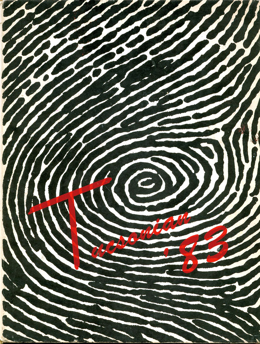
Above is the front cover to my senior year high school yearbook (Tucson High School class of '83!!), and here is the story behind it.
I was on the yearbook staff sophomore, junior and senior year. My brother Andrew had been editor-in-chief his senior year six years earlier, and had also designed the cover, a legacy I coveted. It was between me and Kim, and our adviser, the fantastic Jerry Halfmann, chose Kim to be EiC. I was actually relieved, because I liked Kim and knew she was better cut out for the position. Upon being told, I said, "Oh, that's great! Congratulations, Kim! I get to do the cover, though." To my surprise, everybody just kinda shrugged and said, "Sure, OK."
Like many other punks/artfags/weird people at the time, I was fascinated by Charles Manson (I blame Throbbing Gristle). How great would it be to somehow sneak a subversive Manson reference onto the front cover? I hatched a plan. Later, at an early editorial meeting, the following discussion took place:
Me: I came up with a great theme!
Others: What?
Me: Individuality. We could carry it through easily to all the sections.
Others: Great idea!
Me: And on the cover, a big fingerprint, because what could be more individual than a fingerprint?
Others: Right, um...
Me: And written across it, "Tucsonian '83!"
Others: Awesome!
So I found a photo of a fingerprint, I believe one of the ones from the Tate murder site (Patricia Krenwinkel?), and enlarged it and reinforced/redrew it with ink to make it more graphically appealing (I doubt it would pass muster in court today). I drew the lettering on a separate acetate in a very New Wave splattery style which would be printed in red over the black and white fingerprint... you know, like words written in blood, wheee!
Unfortunately, that's where maybe I went a little too far, because then this conversation took place:
Halfmann: The cover will look great! Oh, we did change one thing, though.
Me: What's that?
Halfmann: We ended up using a brush script for the lettering.
Me: Awww... why?
Halfmann: Somebody thought... and I know this is going to sound crazy, but somebody thought it looked too much like blood.
Me: Oh, oooh, I never thought of that.
Curses! Still, though, I was pleased with the result, and today, brush script has a campy appeal all its own (the "T" is mine). I'm still proud of this very 80s design, and it's always been one of my favorite secret pranks. Most of my classmates liked it just fine, though I heard a little griping about it being too "punk rock." There was some speculation about whose fingerprint it was, but everybody assumed it was a student's, most likely mine.
So anyway, that's how I got a big, bloody fingerprint on the front cover of my high school yearbook.
2 comments:
PURE GENIUS!!!
Subversive graphic design stories are indeed, the staff of life.
Post a Comment