Showing posts with label Drawings. Show all posts

Friday, May 16, 2014

Ugly Tour Bus Non-Photoblogging

 
(Click for bigger.)

I saw a bus today, and I could tell exactly what part of it I wanted to photograph, but alas! I didn't have my camera with me! So I concentrated on it and thought, "I can draw that." So above is a drawing of a detail on a tour bus I saw today. 

Is this getting too esoteric?

UPDATE: I saw the same bus again after doing the above illustration,  and was happy to see I had gotten it exactly right.

Friday, October 11, 2013

Digital Graveyard: Covers And Artwork For Genetic Disorder Magazine, Part 5

(Click front and back designs for bigger.)

I mentioned before that Larry from Genetic Disorder would provide me with copies of the articles from forthcoming issues to generate cover ideas. Nothing much inspired me for issue #18 in 2006 other than a really funny piece about Sambo's restaurant. The article reminded me that I had in my possession a vintage coffee mug from the erstwhile family feed trough, so I realized that this gave me an opportunity to indulge in one of my favorite obsessions: bad food photography! I thought I'd give it a whirl. The good thing about attempting bad food photography is that... well, it's difficult to mess it up, right? It's much easier to make food look awful than it is to make it look good.

The National Gallery of Art serves breakfast for staff members prior to opening hours, and every Wednesday is pancake day, so on that particular Wednesday I came prepared with my camera, tripod,  and a plastic menu card holder (given to me by Pony Pal Ricky Rebel!). I ordered pancakes from Rose, my favorite cafeteria worker, and told her that her flapjacks were going to be stars, much to her bafflement. I located a table facing a blank wall, set up the shot, snapped about a dozen pictures, and then... sat down and ate most of my breakfast. I then adjusted the remains to look gross, and got the second shot for the back cover:


The cigarette butt and the cockroach are, by the way, Photoshopped in.

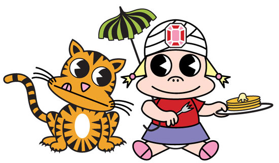
For the contents of the magazine, I designed a fake menu for the plastic holder, using an illustration of, once again, Li'l Kunty, this time in the guise of Sambo's late, post-racist logo:


The "menu" was, like the roach and butt, Photoshopped into the scene (the plastic holder just had a piece of blank paper in it). I was thrilled to call back the cat from my first Genetic Disorder cover to play the tiger.

Here's the Li'l Kunty logo by itself:


This time I didn't do an "ad" for my illustration services on the inside-front cover, because I was no longer seeking such work.

Overall, I'm super happy with how this one came out. It's probably the slickest of all the covers I've done for GD.

Next up: the most recent, and hopefully not the last in this series, features one of my other favorite things, shoes, as well as a frightening doughnut and my own hand.

Part one is here, two is here, three is here, four is here, and six is here. Purchase copies of these wonderful zines here.   Or on eBay if you aren't very bright.

Thursday, October 10, 2013

Digital Graveyard: Covers And Artwork For Genetic Disorder Magazine, Part 4

(Click most for bigger. Apologies for the vector parsing error on the red rat.)

My fourth cover for Larry H's Genetic Disorder zine, completed in 2003, was another case of "This super-complicated idea seems easy! I can do that!" followed, ultimately, with "OMG, what was I thinking?"

Searching for a gimmick, I approached Larry with the idea of doing a 3D cover, something I had always wanted to do. He liked the idea a lot, but said he could never afford to bind in the 3D glasses. "What if I paid for it?" I asked, and we were off to the races.

It ended up being a nightmare. Once again I had assigned myself a task for which I was ill-suited. In the end, however, I think it came out really pretty well, although I believe (I don't currently have a pair of the glasses, so you tell me) I did it backwards, with the reds and blues flipped (so turn over your glasses if you have them).

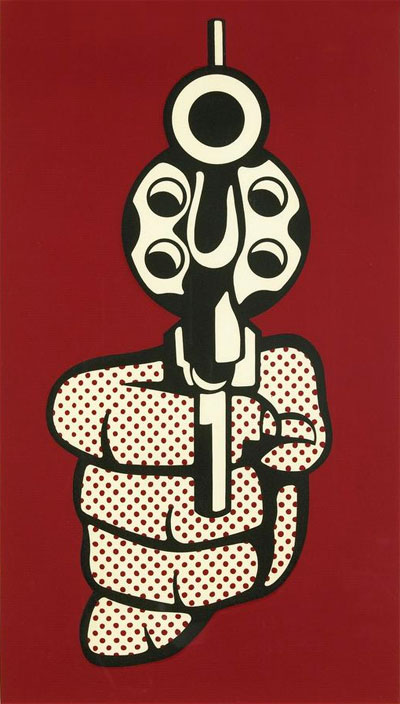
Li'l Kunty, again, is the star of the cover, surrounded by random symbols of death, decay, and destruction, as suits her evil nature. Note that there are several call-backs here to details from the previous covers, as well as a post-911 boxcutter. The hands holding the guns are swiped from Roy Lichtenstein's famous "Pistol" of 1964/68:


After sending in the finished design, Larry and his layout person told me they wanted to put it on a gray background, feeling that the cover looked too anemic on white. I objected strongly, feeling that the gray would blunt the impact of the 3D, and I was right, so above you can see what it was supposed to look like. Alas.

Here's the back cover:


The hands/guns are lifted straight from Bushmiller (surprise!), while the layout is, obviously, based on the Sex Pistols' album cover.

Here's my inside-front-cover "advertisement":


Next up: I turn to (bad) food photography for Genetic Disorder #18.

UPDATE: Part one is here, two is here, three is here, five is here, and six is here. Purchase copies of these wonderful zines here

Monday, September 30, 2013

Digital Graveyard: Covers And Artwork For Genetic Disorder Magazine, Part 3

(Click most images for bigger versions)

After Genetic Disorder #14, the Satanic theme issue, followed by #15, the single-story tour diary, Larry returned to a grab-bag approach in issue #16 in 1999, and the issue featured a variety of articles on a wide range of topics. Also, the size was changed yet again, to classic comic book proportions, so I decided that the "Tales From the Crypt" approach, with circles down one side, was a good way to get a lot of information about the contents onto the front cover. Other than that, I'd say my primary two influences on this project were Sanrio and Garbage Pail Kids.

Larry and I had a great working method: he would give me an envelope filled with all the finished articles from the upcoming issue, as well as descriptions of unfinished pieces, so I always got to read most of the contents for inspiration. Larry always surprised me by pretty much letting me do whatever I wanted. I was especially surprised that he liked this totally slick/girly/cartoony approach in pastel colors, which is so totally opposite to the gritty contents of the magazine.

This time I knew what I was doing, and as a result, the magazine as printed looks exactly like the image above. For the first time, I made absolutely everything a vector image, so nothing had to be left to chance.

The central figure, Li'l Kunty™, is this time displaying her parasitic twin. She has nothing whatsoever to do with the contents of the magazine, other than by using her three issues in a row, she had become something of a mascot. Mostly I just loved the idea of a really cute cartoon character having such a drastic abnormality. Here's the rough version, done in graphite, Prismacolor, and gouache:


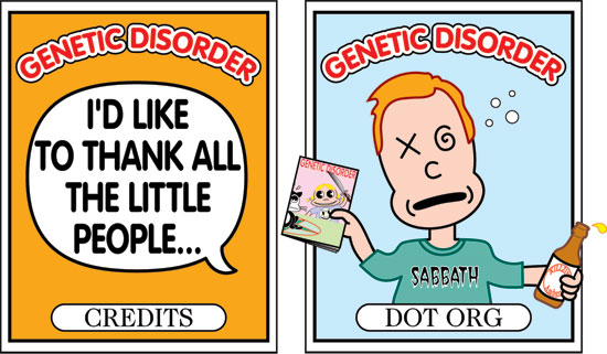
For the back cover, I was able to feature more of the magazine's contents by presenting them as fake trading cards:


That was a lot of work! I had a couple of alternatives and early ideas that didn't make the cut, like these:


And this, a cartoon version of the infamous Brenda "I don't like Mondays" Spencer:


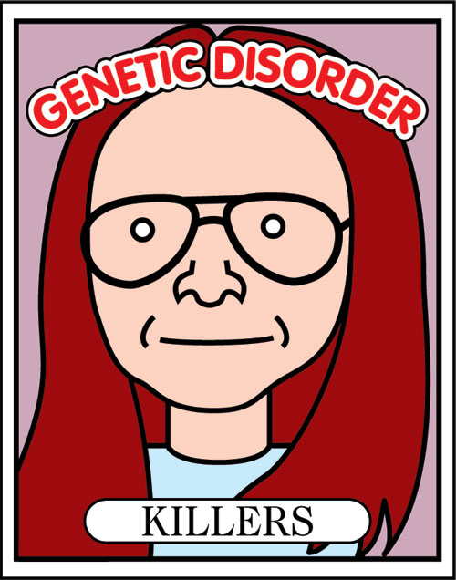
Brenda got bumped in favor of Gary Heidnik. I'm not sure why! Drawing Heidnik was a real challenge, because I suck at likenesses, and because it was hard to make it realistic enough to look like him, but still cartoony enough to fit in with the rest of the illustrations. This is the photo I used for reference:


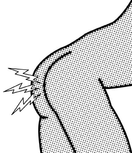
I also did an illustration for the inside of the magazine, for the "Cursed Ass" story promised on the front cover:


I remember Larry's reaction to that one was, "Ha, ha. that looks like porn," to which I probably responded by changing the subject.

And finally, for the inside front cover, to advertise myself, I chose this image, a drawing I did as a study for a painting:


Have you accepted Talking Captain Kangaroo Doll as your personal savior?

Next up: Genetic Disorder #17... in 3D!

UPDATE: Part one is here, two is here, four is here, five is here, and six is here. Purchase copies of these wonderful zines here.  

Thursday, September 26, 2013

Digital Graveyard: Covers And Artwork For Genetic Disorder Magazine, Part 2

(Click any for bigger.)

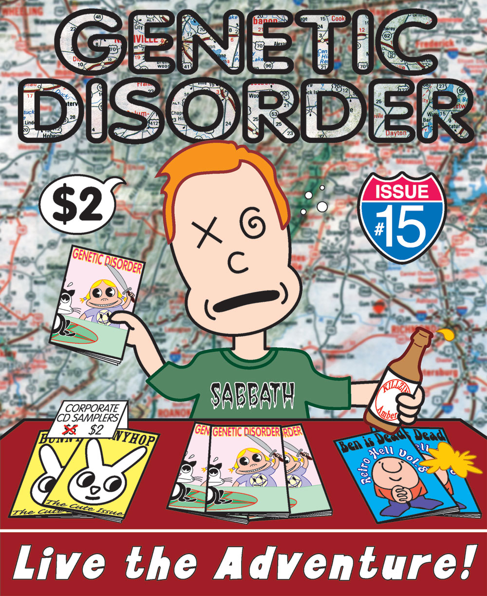
In 1996, after publishing Genetic Disorder #14, Larry and the publisher/creators of Ben is Dead and Bunnyhop magazines rented a Winnebago and went on a nationwide tour to publicize and promote the underground publishing scene. This issue, #15, consists almost entirely of Larry's tour diary.

So the cover illustration is a literal interpretation of the story. It shows Larry himself, drunkenly selling magazines and donated merchandise at a table in a bar. The background is just a generic road map. Like the last cover, this was my first idea, and I stuck with it with no revisions. Larry was initially a little hesitant about "putting myself on the cover of my magazine." I countered, "You're not putting yourself on the cover of your magazine; I'M putting you on the cover of your magazine."

The biggest design challenge on this one was knowing that I had to break the rule about having too many different typefaces on the cover. It was impossible, because just featuring three different magazines on the table required three typestyles right off the bat, and rendering the issue number in the form of a highway sign required yet a fourth style of lettering. Realizing it was hopeless, I threw caution to the wind and chucked in three more fonts at the bottom, the beer bottle, and on Larry's shirt. It's a fontstravaganza!

But I still really like this drawing! It was my first ever complicated (for me) design I ever devised entirely in Adobe Illustrator. My favorite thing was being able to "call back" the previous cover design. I fell in love with that cartoon girl, named her "Li'l Kunty", and even wrote (but never finished drawing) a graphic novel ("Awfully Cute") about the character.

The back cover shows what I'm sure the tour participants eventually wanted to do:


Originally I had a silhouette of Larry and his bicycle standing at the top of the cliff, and a word balloon emanating from the Winnebago saying, "Where's Larry?" I like it better without it. The vehicle was traced in illustrator from an ad in the LA Times.

Here's the big mistake I made on this one, a mistake I never made again: I didn't know enough about how to adjust artwork for printing on glossy stock, so the whole thing came out dark and over-saturated, especially the background, which you can see in the thumbnail here. The version seen above shows how the cover was supposed to look. Lesson!

As payment for doing the cover, Larry gave me the inside front cover to do with what I pleased. For this, I did a fake merchandizing sheet for "Li'l Kunty", based almost word-for-word on a Betty Boop merchandizing sheet from the 30s:


Next: A shitload of work for my favorite cover ever, Genetic Disorder #16.

UPDATE: Part one is here, three is here, four is here, five is here, and six is here. Purchase copies of these wonderful zines here

Tuesday, September 24, 2013

Digital Graveyard: Covers And Artwork For Genetic Disorder Magazine, Part 1

(Click any for bigger.)

I first met Larry Harmon, creator of Genetic Disorder, in about 1997 in San Diego. GD was (is?)  a lively, hilarious, and well-written "zine", and Larry was a respected and influential member of the underground publishing community. Like many other zines, GD was, at its core, a music fanzine, featuring record and concert reviews, interviews with bands, etc. But the remainder of the publication was a highly inventive grab-bag of random, well-written and scrupulously researched, articles about whatever was obsessing Larry and his rowdy friends at the moment. At the time, I was working full-time for Hypno, a magazine with commercial, mainstream aspirations, and always felt a little embarrassed when I saw how cool Genetic Disorder was.

In 1995, Larry mentioned to me that he was going to do a big theme issue on Satanism, and I immediately begged him to do the cover. I think Larry had met my over-the-top "Satanic" friend Ricky Rebel, and had seen what we had done with Satan Brand Magazine, so he enthusiastically agreed.

I came up with the idea of cute kids about to sacrifice a cat almost instantaneously; it was my first idea and required no revision. I drew the characters in a kind of wireframe style using the most pitiful, primitive PC graphics programs imaginable. I'm pretty sure it was Autodesk Animator. I then printed all the individual elements out, pasted them up, and then "reverse painted" the illustration with cel vinyl on a sheet of stiff acrylic at a 1:1 ratio. Larry added the title lettering in Photoshop, using VAG Rounded at my request, and I loved how the whole thing came out. And the whole issue, brimming with hilarious and astonishing tales of Christian Satanic Panic, bone-headed metal fans, and an incredible calendar of daily Satanic fun facts, one relevant to every single day of the year, was a new high water mark for Larry and GD.

Larry and I worked so well together that I ended up doing the next five covers (all of which feature the grinning little girl with pigtails) for Genetic Disorder, too, and if he ever produces another issue, I hope to do that one as well. I never charged Larry a cent, because it was just so much fun doing the covers for him, and so gratifying to have something physically printed (remember those pre-internet days?). I even paid to make one expensive cover idea possible! Part of that bargain, I suppose, is that I made mistakes on every single one of them, so it was a valuable learning experience for a totally untrained dilettante like me (I'm not being modest; I have never taken a single course in graphics, so doing these covers was literally my education).

About a year after doing this cover, I started learning how to use Adobe Illustrator, and remade the illustration as a proper vector image:


You can still buy all of these, including the one featured here, which is highly recommended, at Larry's somewhat rudimentary GD website. Collect them all!

Next: Larry and my cover design hit the road in Genetic Disorder #15! Live the adventure!

UPDATE: Part two is here, three is here, four is here, five is here, and six is here. Purchase copies of these wonderful zines here.


Friday, August 30, 2013

Digital Graveyard: Magazine Cover Illustration, 2001

(Click for bigger.)

I did the above illustration for the cover of a short-lived Washington, DC entertainment and nightlife monthly called Play DC in early 2001*. You can see how I left space at the top and bottom for the title and lettering. They also censored me! They requested that I remove the "lube" from the bedside table, which I thought was funny because they didn't ask me to remove the whip, handcuffs, or condoms. I think the story was about fuck buddies?

Anyway, I think this is... OK. It's cute, but way too static. The published version with the lettering actually looks a lot better Eh. I've done worse. I'm unable to muster much enthusiasm for this design.

*This freebie publication left zero traces on the internet. I found some remnants of it here at archive.org.

Friday, January 20, 2012

Digital Graveyard: How To Design A CD Cover For Negativland, 1998-99, Part Two

When I left off in the last post, Mark Hosler of Negativland and I had expanded the CD cover artwork from a single square with artwork on one side and text on the other to a double-square folded in the middle. Meanwhile, the band's lawyer was nervous about how we were using the Teletubbies.

What happened next was that Mark really loved how the artwork was looking (find me an illustrator who can resist such praise from a client), so he wanted more of it. He now wanted the cover to be four squares in a row, accordion folded, with art on one side and text on the other side. So now I really had to double the length of the artwork once again. I still wanted to show a continuous Teletubby-inspired landscape, but just having more rolling hills and flowers seemed like a cop-out. What else could I add?

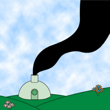
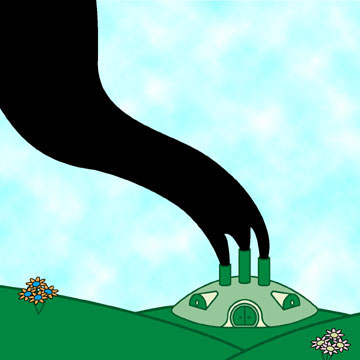
Inspiration arrived in a CD of rough mixes and fragments of the Negativland audio for the album. There was a lot of stuff about polluted water and factories, so that gave me the idea of showing a factory in the shape of the Teletubby house. My first rough try was feeble:


The revised version is modeled much more closely on the Teletubby house, and is much better (excuse the flop):


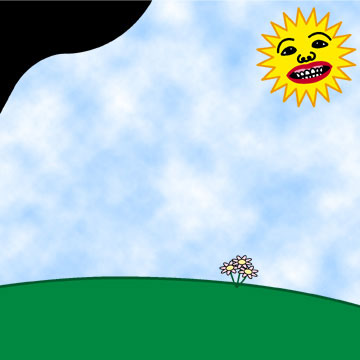
For the third panel, I wanted to include the Teletubby "sun with a face," but with a face based on the front cover of Chumbawamba's boffo smash, Tubthumper:


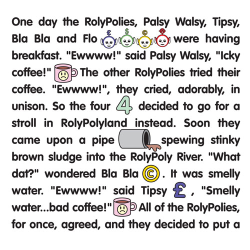
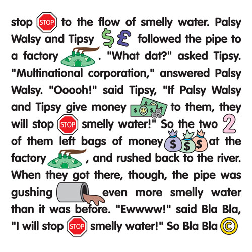
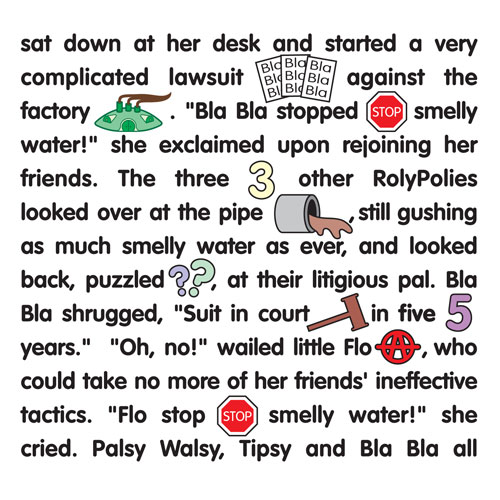
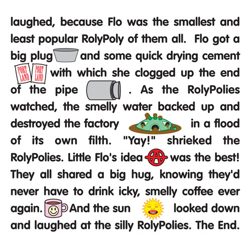
There was too much empty space, and I couldn't figure out how to fill it. But then I got the best idea: I suggested to Mark that there was now ample room on the artwork side to include all the credits they were originally going to put on the back of the insert. My new idea for the reverse side was to write and illustrate a "Highlights for Children"-style picture story which could weave together all the political and satirical themes in a story starring our Teletubby characters, which I would call "The RolyPolies, " thus making their use all the more obviously parodic and, therefore, more lawsuit-proof. Everybody was happy with this idea, so this is what I came up with:


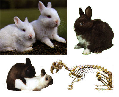
Next I had to round up some photographic images of real bunnies, just as the rabbits on the Teletubbies were the only "real" things. I particularly wanted to find an image of rabbits having sex for the back cover, and it says a lot about the internet in 1998-9 that I was unable to find a suitable one on the web. I had to buy a rabbit manual at a pet store to finally find a good one:

 
Now it was time to pull it all together. Here's how the whole front side of the folding cover art came out with the credits added and the typography toned way down (with lines to indicate where it folds. Click the image to see lots bigger):


The rabbits in the image above, by the way, are place-holders; somebody else ended up placing the bunnies for me later.

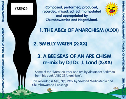
I also put together the back cover image for the CD. Here's the first attempt:


And then more-or-less the final design, with provisional type:

(Click for larger)

The CD itself:


And the image beneath the clear plastic tray behind the CD, combining the Teletubby head, the Chumbawamba face, and Negativland's logo sprouting from the ghastly creature's head:


So anyway, that ended up being a LOT more work than what I first signed up for, considering that I first thought I was simply going to provide one 5" x 5" image. I wouldn't say I was a beginner in 1999, but I sure wasn't advanced enough for this project. All in all, however, I'm still really pleased with the candy-like end product, so cheerful and (mostly) innocent looking. I wanted to create a Teletubby vibe and I think I at least accomplished that. I don't think I'd do a much better job today; maybe the drawings would be more refined. I'm not wild about the Chuimbawamba face.

The CD didn't have much of an impact, even by Negativland's fairly cultish standards. I think they manufactured a shitload of them, thinking all of Chumbawamba's new fans would leap on the release. Negativland openly admitted to a purposeful intention to piggyback on the success of their British friends, hot on the heels of Chumbawamba's unexpected massive worldwide #1 hit. Too bad that once the CD came out, people had had it up to HERE with "Tubthumping."

You can get it still, brand new, for crazy cheap through Amazon affiliates.

Next time from the digital graveyard: surf/rave fashion logo designs from the mid-to-late 90s!

Monday, December 12, 2011

I Drew A Picture Of Callista Gingrich For You


UPDATE – Robin Givhan decided to examine Callistastyle at the Daily Beast, and it's pretty good, but she doesn't really say anything you haven't already read here. Givhan decides that Callista, whom she compares unfavorably to rival goddess Cindy McCain, appears to be out of touch, old-fashioned, and her appearance requires too much effort. She notes that Goddess Callista dresses older than she is, but doesn't connect the dots to arrive at the explanation I've given here: she does it in part to minimize the obvious age difference between her and Newt. Anyway, for the most part Givhan's observations are spot-on.

Tuesday, November 22, 2011

Thursday, November 17, 2011

Miscellaneous Glori Possibilities


My freehand pencil drawings aren't as "good" as my computer drawings, but they have a lot more personality.

In other news, I've fallen in love with Glori all over again. I'm going to have to start drawing her again.

UPDATE: Wow, I guess I'm the only one in love with Glori.

Wednesday, November 16, 2011

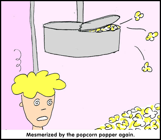
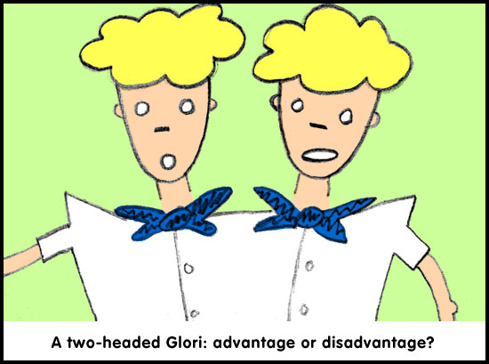
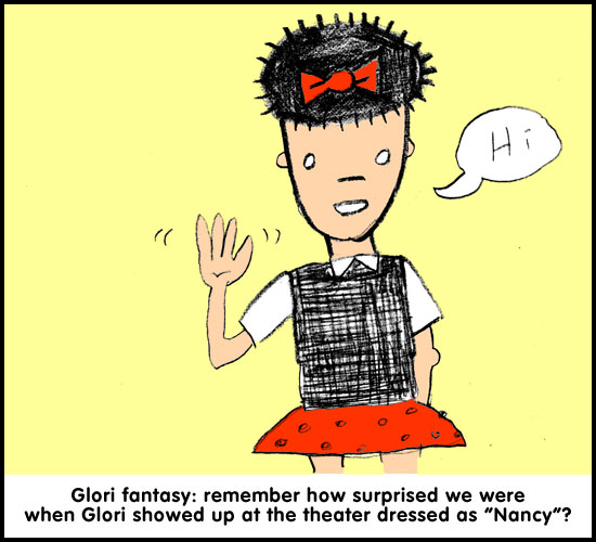
How To Draw Glori, The Popcorn Girl


Now let's have some fun! Think of something exciting to do with Glori! Draw a picture of her in a typical situation (Glori falls into a reverie while contemplating Milk Duds) or an atypical one (Glori mud-wrestles Linda Ronstadt):