(Click any for bigger.)
In 1996, after publishing Genetic Disorder #14, Larry and the publisher/creators of Ben is Dead and Bunnyhop magazines rented a Winnebago and went on a nationwide tour to publicize and promote the underground publishing scene. This issue, #15, consists almost entirely of Larry's tour diary.
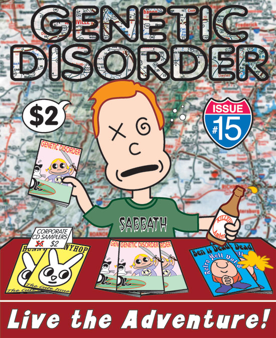
So the cover illustration is a literal interpretation of the story. It shows Larry himself, drunkenly selling magazines and donated merchandise at a table in a bar. The background is just a generic road map. Like the last cover, this was my first idea, and I stuck with it with no revisions. Larry was initially a little hesitant about "putting myself on the cover of my magazine." I countered, "You're not putting yourself on the cover of your magazine; I'M putting you on the cover of your magazine."
The biggest design challenge on this one was knowing that I had to break the rule about having too many different typefaces on the cover. It was impossible, because just featuring three different magazines on the table required three typestyles right off the bat, and rendering the issue number in the form of a highway sign required yet a fourth style of lettering. Realizing it was hopeless, I threw caution to the wind and chucked in three more fonts at the bottom, the beer bottle, and on Larry's shirt. It's a fontstravaganza!
But I still really like this drawing! It was my first ever complicated (for me) design I ever devised entirely in Adobe Illustrator. My favorite thing was being able to "call back" the previous cover design. I fell in love with that cartoon girl, named her "Li'l Kunty", and even wrote (but never finished drawing) a graphic novel ("Awfully Cute") about the character.
The back cover shows what I'm sure the tour participants eventually wanted to do:
Originally I had a silhouette of Larry and his bicycle standing at the top of the cliff, and a word balloon emanating from the Winnebago saying, "Where's Larry?" I like it better without it. The vehicle was traced in illustrator from an ad in the LA Times.
Here's the big mistake I made on this one, a mistake I never made again: I didn't know enough about how to adjust artwork for printing on glossy stock, so the whole thing came out dark and over-saturated, especially the background, which you can see in the thumbnail here. The version seen above shows how the cover was supposed to look. Lesson!
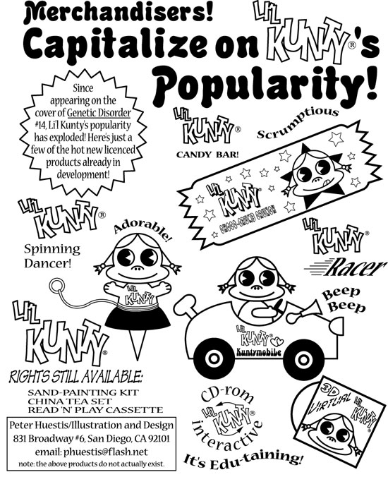
As payment for doing the cover, Larry gave me the inside front cover to do with what I pleased. For this, I did a fake merchandizing sheet for "Li'l Kunty", based almost word-for-word on a Betty Boop merchandizing sheet from the 30s:
Next: A shitload of work for my favorite cover ever, Genetic Disorder #16.
UPDATE: Part one is here, three is here, four is here, five is here, and six is here. Purchase copies of these wonderful zines here.


4 comments:
Is that the same Winnebago that you used for the Radio Limbo bumper stickers? That one had even Wikipedia fooled for the longest time.
Yes! Same Winnebago! I remember that graphic worked really well, because the authorities were actually looking for a Winnebago containing the terrible illegal commie radio signal. Good stuff! I had totally forgotten about that.
You made him look like an angry drunke. Is that an accurate depiction?
Absolutely yes. But funny, too.
Post a Comment