Showing posts with label Art Collection. Show all posts

Monday, July 06, 2015

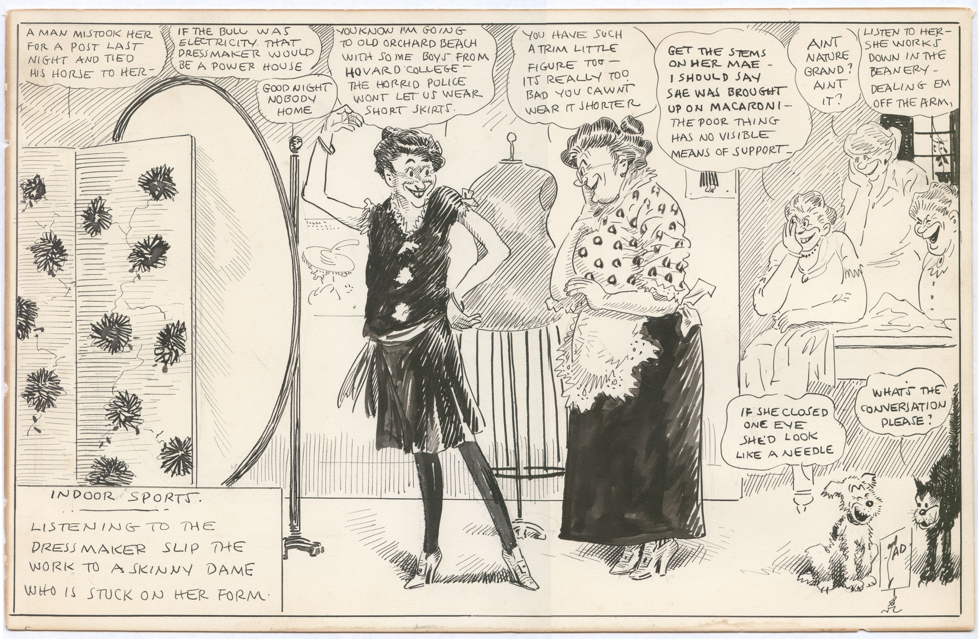
Art Collection: "Indoor Sports" Drawing By Tad Dorgan, Ca. 1923

(Click for a lot bigger.)

It's been a while, but I've acquired a new "Indoor Sports" drawing by the prolific Thomas A. "TAD" Dorgan, and this one is a rarity: an all-female scene. Tad's cartoons usually took place in a man's world, so this one is a real treat.

The scene is a clothing store for ladies, and the central figure is trying on a bathing costume; yes, that is a swimsuit, complete with stockings! Tad's scorn is aimed primarily at the customer, who seems to think she's a real beauty despite being what would be seen at the time as grotesquely thin (this is almost a half-century before Twiggy, remember). His secondary target is the insincerity of the dressmaker, really laying it on thick to close the sale. Crowding the rest of the cartoon is Tad's typical Greek chorus of scornful onlookers.

The drawing is undated, but it's easy to narrow things down to a couple of years thanks to the style of the bathing costume. In the 1920s, standards of bathing suit decency quickly relaxed, and one-piece suits had become de rigeur by the second half of the 20s. The customer's comments show that shorter skirts were coming in, but still resisted in some areas. Furthermore, "Ain't Nature Grand" was a popular song published in 1921. All these points indicate a likely date of 1922-25.

Most of the slang in this one is pretty easy to decode. "Pins" were legs, and "dealing 'em off the arm" is an old term for waitressing, but otherwise everything is fairly straightforward. "What's the conversation" is early 20th century for "WTF?" and would remain a popular term for years to come.

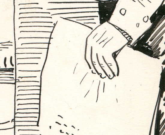
Stylistically, this is top-notch Tad, with lots of brushwork, pen hatching, patterns, a well thought-out space and plenty of figures and objects. He kind of loses it on the customer's upraised arm, but I'll forgive him that, because the pose is hilarious. When Tad spent more time on a drawing such as this one, it really shows.

Click the "Tad Dorgan" tag below for LOTS more of his work.

Tuesday, June 23, 2015

Art Collection: Magazine Drawings By College Student Mort Walker, 1947-8, Part Two

(Click any for bigger. Recommended!)

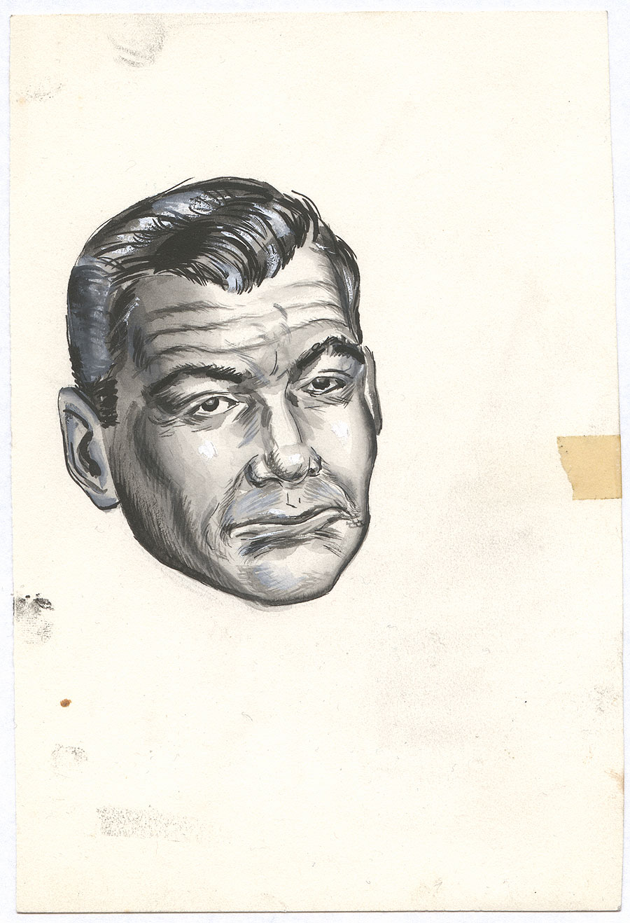
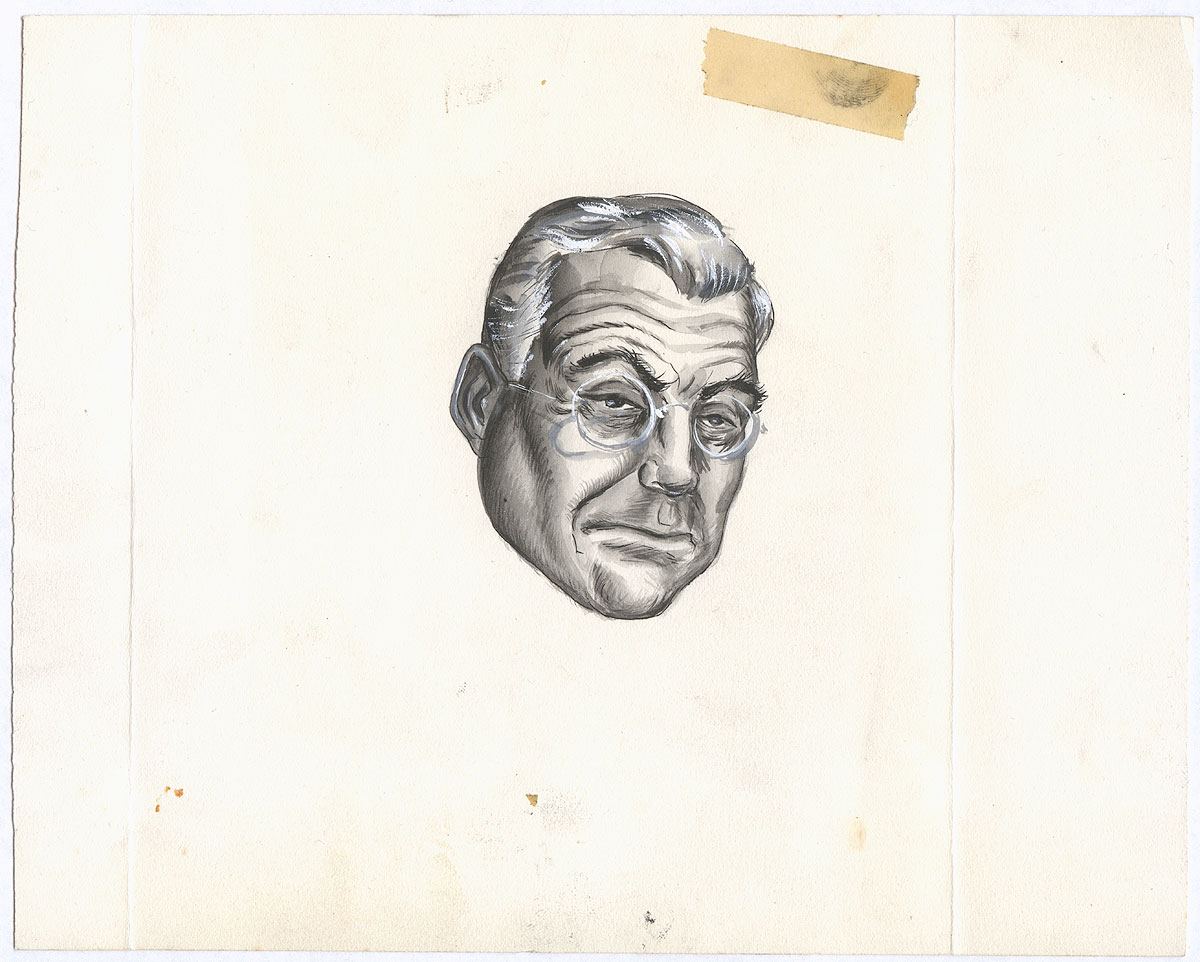
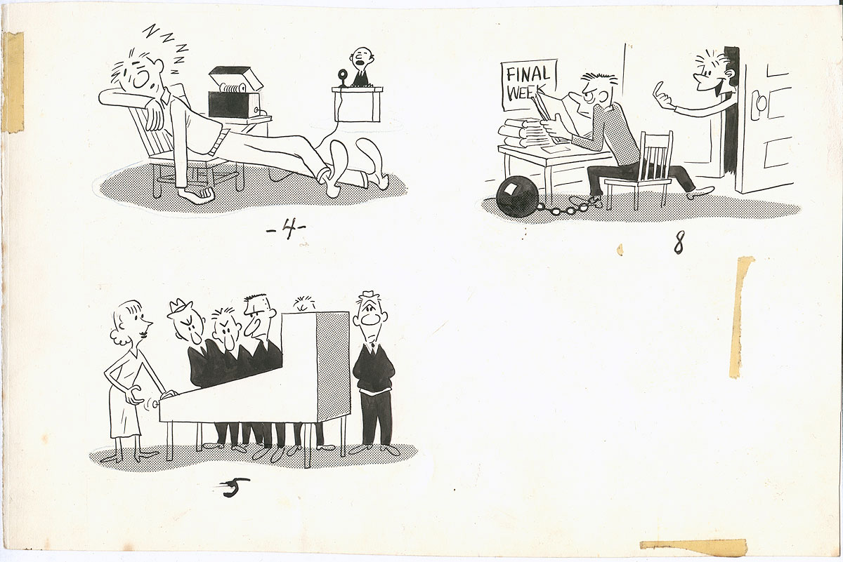
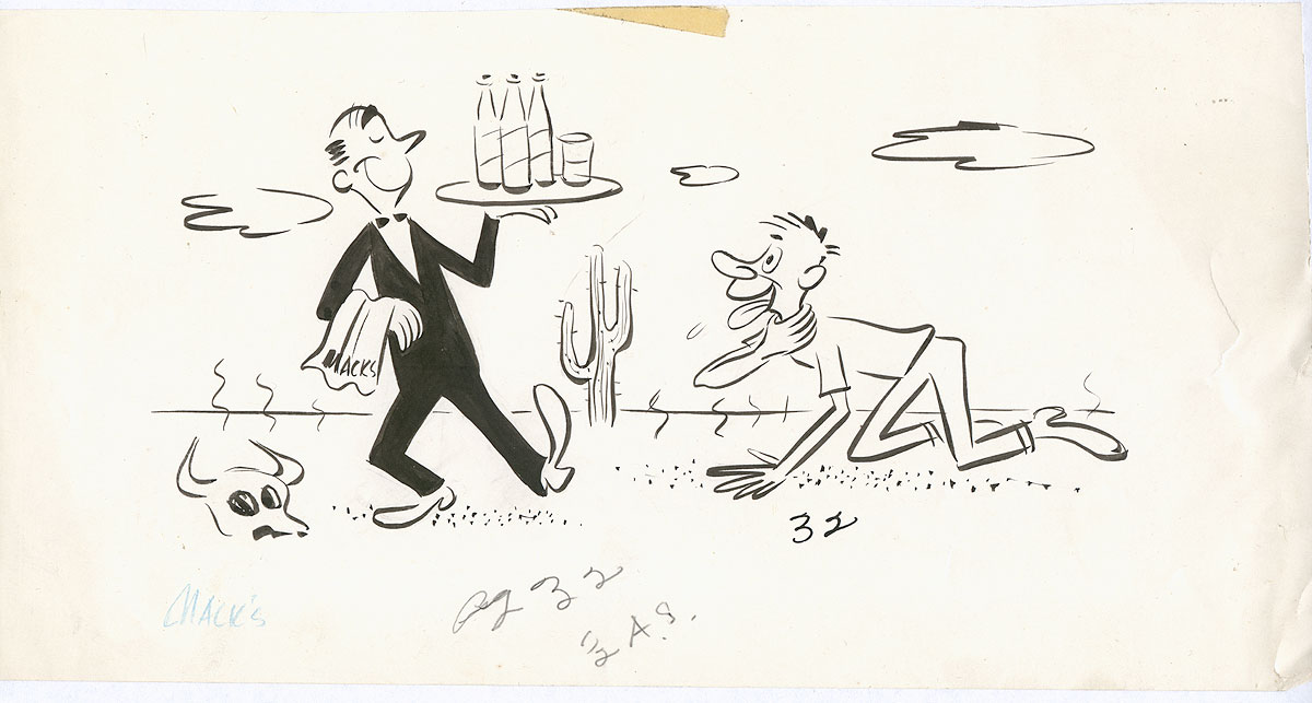
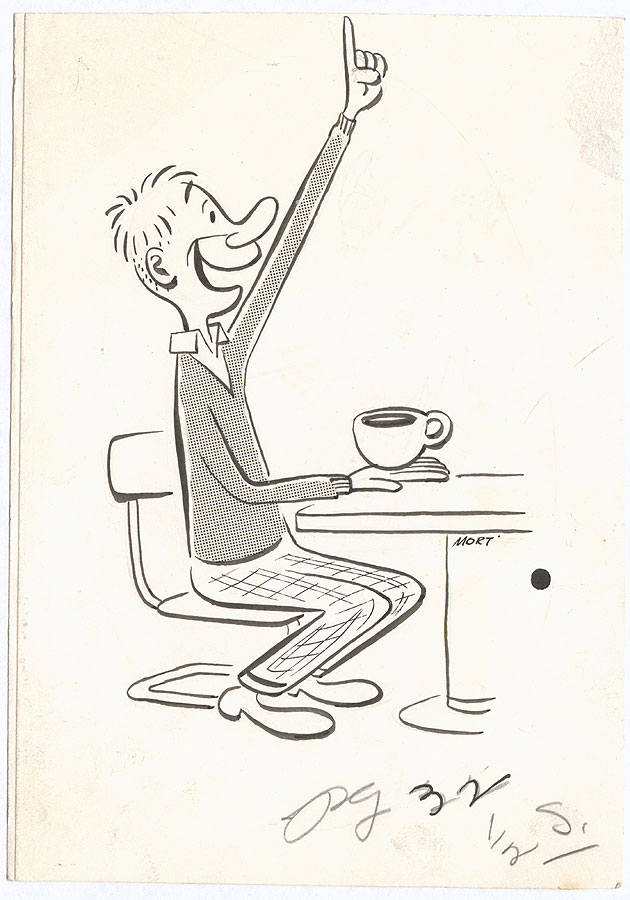
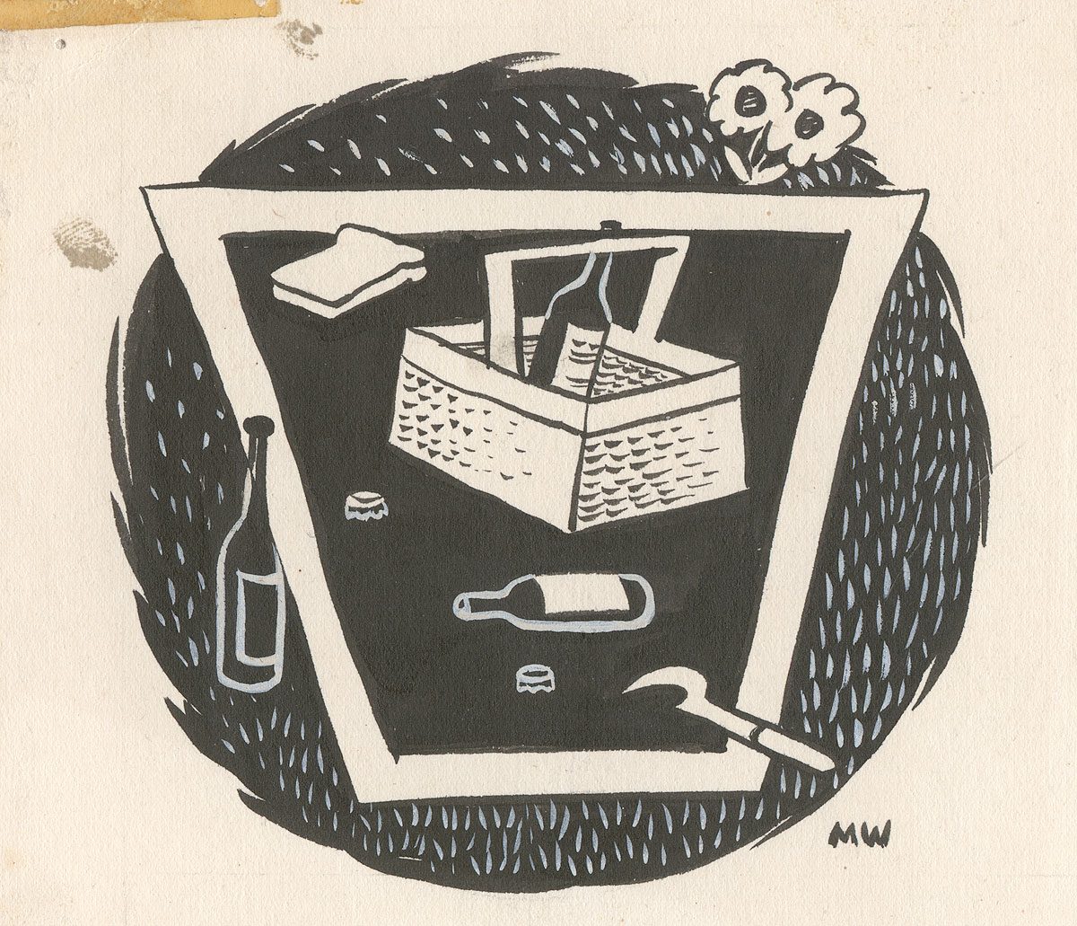
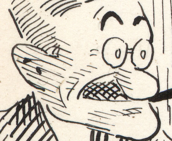
More fun college art from Mort Walker, drawn for the University of Missouri's "Missouri Showme" magazine. First up are two superbly competent deviations from Walker's "big foot" cartoony style, realistic portrait heads (unlabeled, alas) executed in brush, pen, and ink washes with white highlights. Very nice work, if a bit wooden. One can sense the laborious nature of these drawings, and they seem like more of an assignment than anything. Perhaps they were!


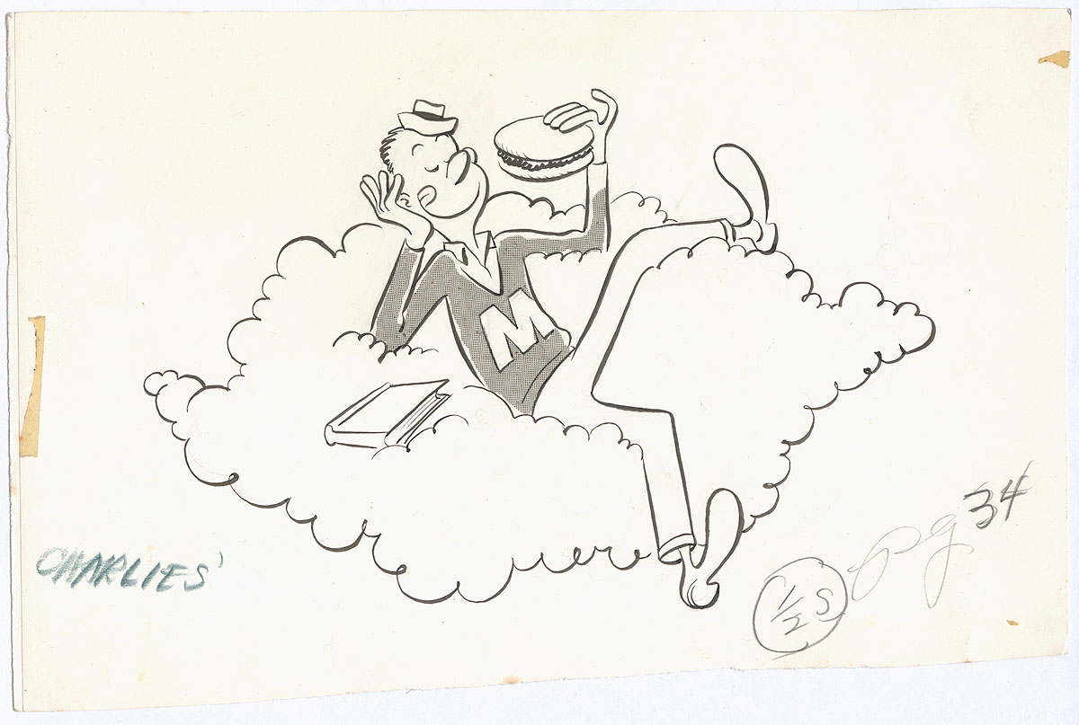
Now back to the more silly work we'd expect from Walker, another ad for Charlie's Café:


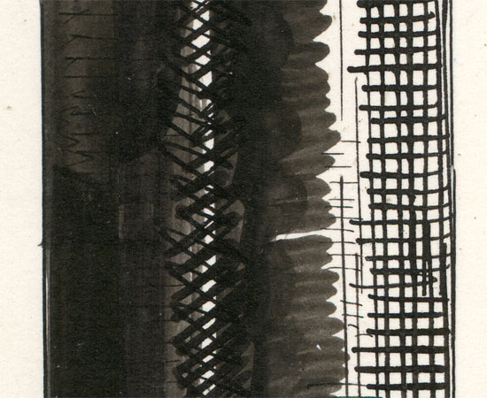
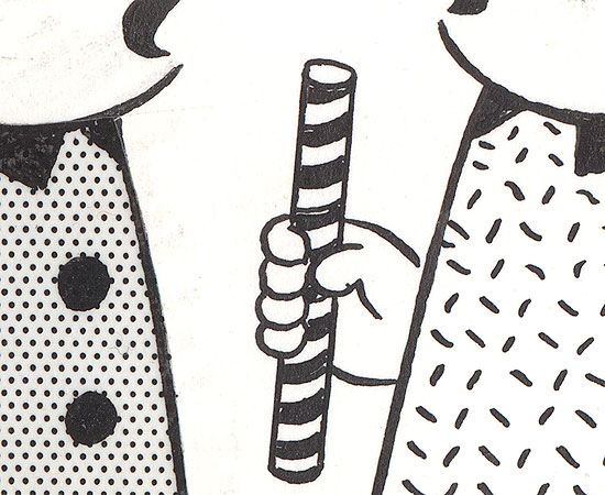
I really like his "raggedy" use of dot screens, although it does verge on sloppy in some cases. More fun spot illustrations:


His love of drawing people in humorous lounging/sleeping positions would come to serve him well in Beetle Bailey!


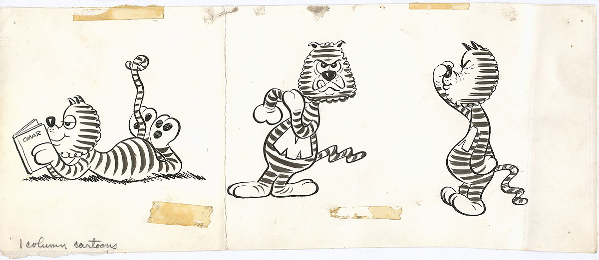
These are drawings of the UM mascot, Truman the Tiger:


Clearly Walker had no future as a "funny animal" cartoonist, but he gave it the ol'... college try!

And that concludes this episode of "Before They were Famous". Really glad I bought these fun drawings. 

Thursday, June 18, 2015

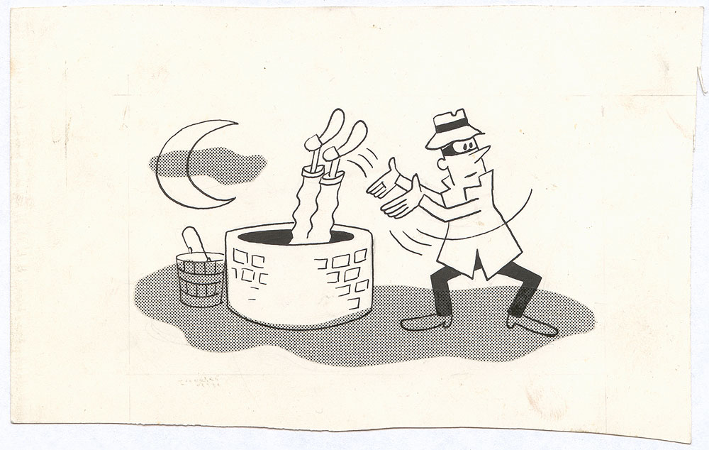
Art Collection: Magazine Drawings By College Student Mort Walker, 1947-8, Part One

(Click any for bigger. Above: ad drawing for Charlie's Café.)

I love seeing the early, pre-fame work of well-known cartoonists. It's fascinating to see them groping for a style. These drawings were executed by Mort Walker, later the creator of Beetle Bailey, Hi and Lois, Sam's Strip, and others, for his college magazine, the Missouri Showme, when he was a student at the University of Missouri in 1947-8.

(Ad drawing for Charlie's Café.)

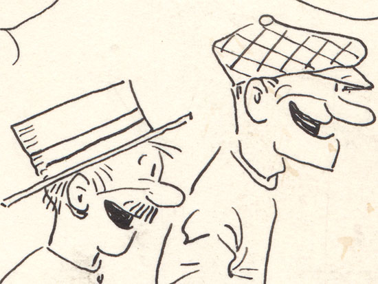
As with the early work by Johnny Hart in my collection, here you can see Walker working in a classic, stereotypical "mid-century modern" cartooning style, and it's obvious that he's influenced more by magazine and commercial illustration than by comic strip artists. Compared to Johnny Hart's crude efforts, Walker has a real flair for the style, knowing just how to balance angularity with bulbousness. Clearly he was a natural-born cartoonist:

He's got a way to go, however. For instance, I find his failure to cut out the feet and bucket from his Zip-a-tone, above, to be almost inexcusable.


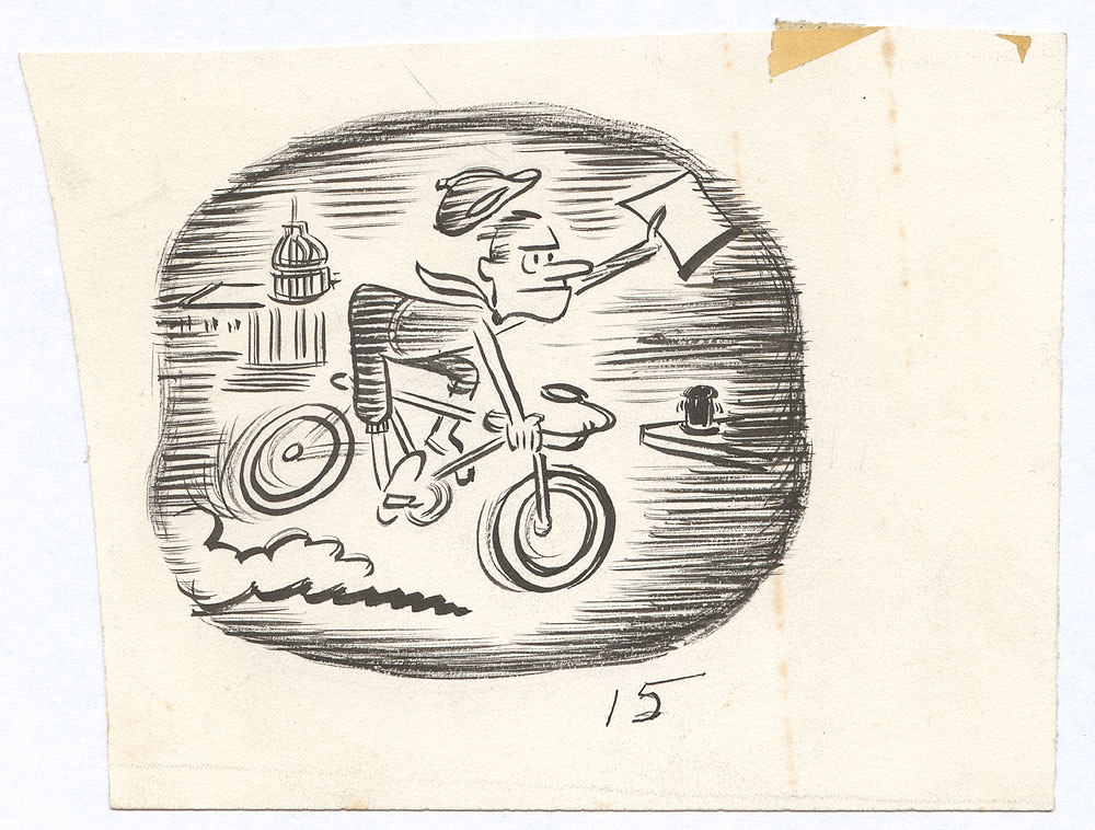
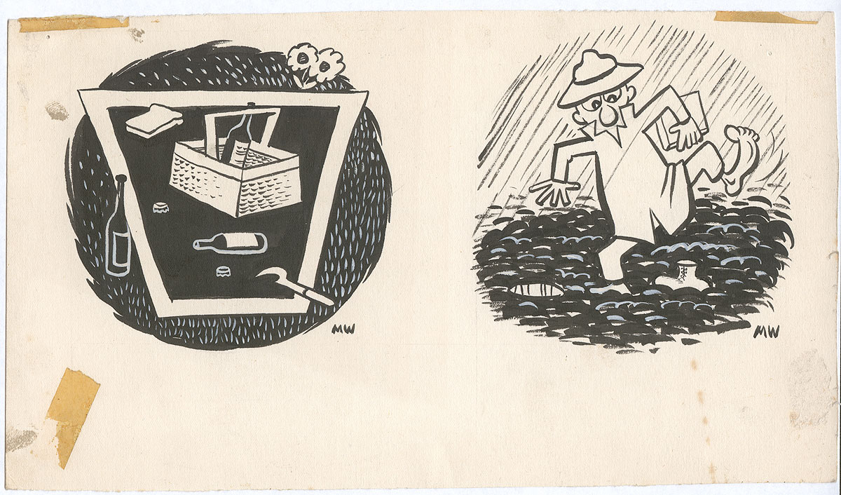
Another hallmark of student work is experimentation with technique and style. Above, he's used horizontal lines in an interesting way. Below, in both drawings, he's using white paint to achieve certain effects. On the left he's experimenting with a modernist faux-woodcut style in a drawing which reminds me very much of Wanda Gag's work.

Walker was familiar with modernism, and even did a spot-on Picasso parody (with a REALLY dirty "cherry" joke) for the cover of the magazine, a transgression which earned him a suspension as editor.

 
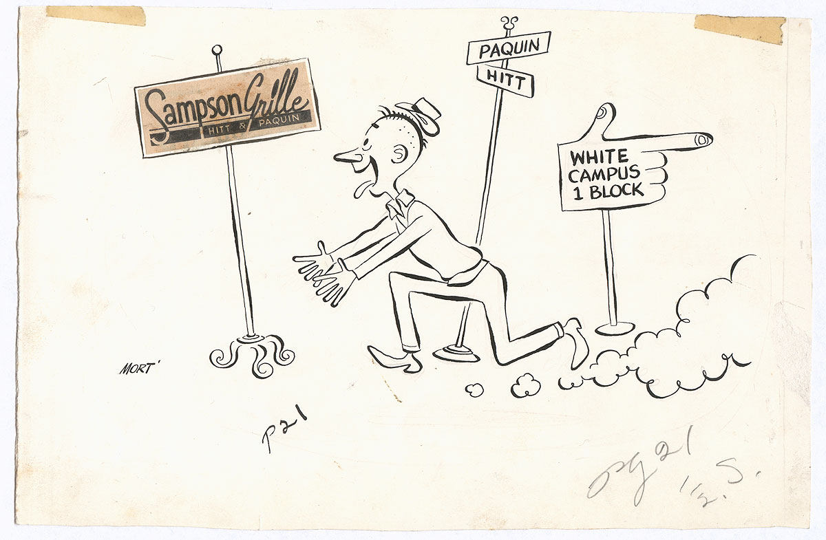
(Ad for Sampson's Grill.)

These drawings might not look much like Beetle Bailey, but their are some hallmarks of his style already present: the figures are lively and energetic, he has a tendency to give more emphasis to white or empty areas over blacks or shading, he composes carefully and with clarity, and he doesn't vary his line width much. These traits would serve him well when he started Beetle Bailey just a few years later in 1950.

You can read more about Mort Walker and the Missouri Showme at the link above, at Mort Walker's website,  at the Columbia Daily Tribune, and at UM's website.

More in a day or two!

Wednesday, June 17, 2015

Art Collection: Can You Guess The Artist?

(Click for bigger.)

I just acquired twelve drawings by this artist. They're all from 1947-8, just a few years before he became very famous and successful. More, and the answer, tomorrow!

Wednesday, July 02, 2014

Art Collection: "Indoor Sports" Drawing By Tad Dorgan, 1925

(Click for lots bigger.)

Another outstanding Tad drawing! Like the last one, this one is labor-intensive, with lots of shading, hatching, beautiful pen work and loads of details, sharply observed clothing, etc. It's a pretty funny gag! Italian barbers struggle with a crossword puzzle due to a language barrier they haven't quite overcome, while their African American colleague chuckles at their efforts.

People are often quick to call any portrayal of black characters by Anglo artists of this period "racist," but I disagree in this case. Here, the African American character isn't really portrayed any more or less grotesquely than the others, and furthermore, he's shown as being smarter, the wry observer of the scene. Dated, sure, but racist? I honestly don't think so. If anything, the way the Italians are shown is more insulting. What do you think?

There are a few details to unpack in this one! I was unable to find the origin of the phrase "You can't blame a guy for trying," but Mizner almost certainly refers to the notorious Wilson Mizner, a popular playwright, colorful raconteur, and co-owner of the famous Brown Derby restaurant.

The location by the signature is spurious. Tad took to doing this as a joke, giving far-flung locations by his signature during this period, some glamorous and others less so. The gag is that Tad was a convalescent during the last years of his life, and rarely left his home in Great Neck at all. The sad story behind this can be found here. Another drawing with a false location can be seen here.

And poor Tad, banished to the suburbs due to ill health, could no longer enjoy his beloved boxing matches. The best he could hope for was a neighborhood brawl, comically announced in the fake match poster on the wall. Funny detail!

The song quoted in the lower right, "Birmingham Papa, Your Memphis Mama's Comin' to Town", is a real song from 1924 made famous by Eddie Cantor. You can see a photo of the sheet music here, and you can hear an amazing 1925 version of it here.

Tuesday, July 01, 2014

Art Collection: "Indoor Sports" Drawing By Tad Dorgan, Ca. 1924

(Click for LOTS bigger.)

I just picked up two more Tad drawings, and both of them are stellar. This one is so highly detailed, with such exuberant pen work and detailing, that I uploaded a larger scan than usual, rather than posting details. I believe this is one of the best drawings in my collection.

And, refreshingly, the idea isn't dated at all: the overworked peon is getting his courage up to ask the bosses for a raise. It's a classic scene of income inequality: the sweating* worker is harried and exhausted, while the nattily dressed upper-class discusses their labor-free moneymaking wheeling and dealing.

And, again, what other cartoonist devoted this much time to clothing? I can't think of a single one.

Again, we've got the "What - No Spinach" gag, which I explained here, and another one of Tad's funny little made-up songs as secondary (or even tertiary) jokes. This is Dorgan at his absolute best.

*It's worth pointing out that Tad never used iconic comic strip shorthand in his Indoor/Outdoor Sports panels. Note that the sweat on the worker is portrayed naturalistically, not  flying off his head. He didn't use motion lines or other gimmicks, either. He did, however, use these in his Judge Rummy slapstick strips.

Wednesday, June 18, 2014

Art Collection: "Indoor Sports" Drawing By Tad Dorgan, Early 1920s

(Click for bigger.)

Here's another great Tad drawing of office politics from the early 20s. How to deal with the office bores? Simply set them on each other! This one lacks a lot of archaic slang, so it's not as impenetrable as a lot of the other ones I've featured here. Note how short neckties were during this period, and that they were outnumbered by bow ties.

Tommy Ryan was a famous boxer who ended his career in 1907, so the blowhard in the background is really reaching into the past for his story of erstwhile glory. 

Technically, wow, Tad really went all-out on this one. Look at all the work he put into that column! He obviously spent a lot of time on this drawing.

Some details, because this example really deserves it:


Sunday, May 11, 2014

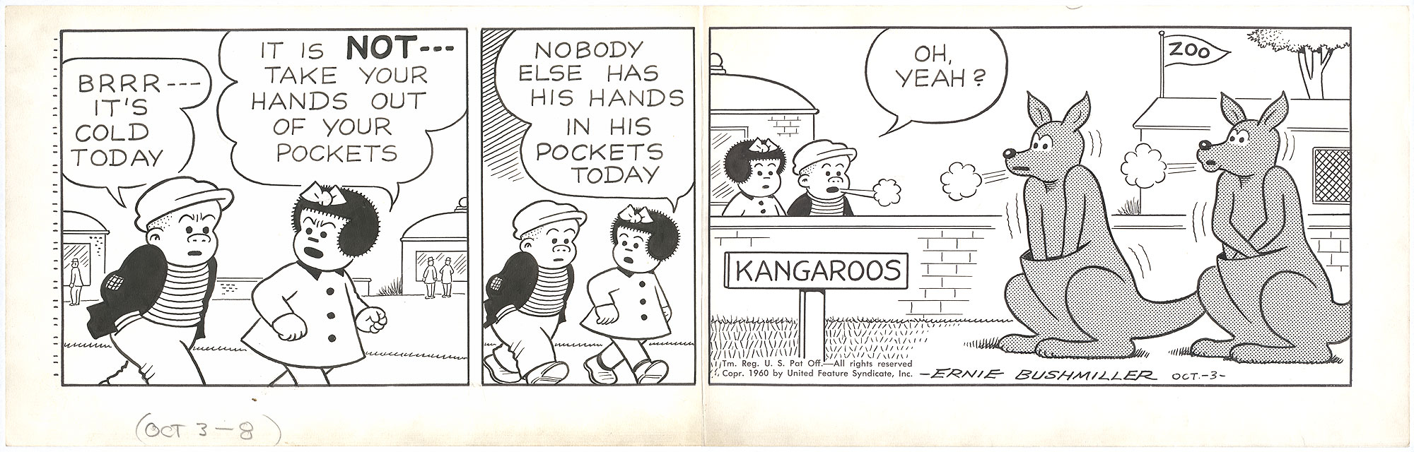
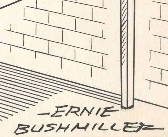
Art Collection: Drawing For "Nancy" Daily By Ernie Bushmiller, 1960

(Click for bigger.)

Another early 60s Bushmiller in superb, nearly untouched condition. I don't really have much to say about this one! It's good, of course, but it doesn't absolutely kill me like others in my collection from this period. Also, is it just me, or is that enclosure for the kangaroos not very well thought out? That wall seems awfully low. Actually, the longer I look at this one, the worse it gets; those animal drawings are terrible. You can tell that Bushmiller started with the idea of doing a kangaroo gag and then worked backwards. It's always a lot of fun when Nancy and Sluggo go to the zoo!

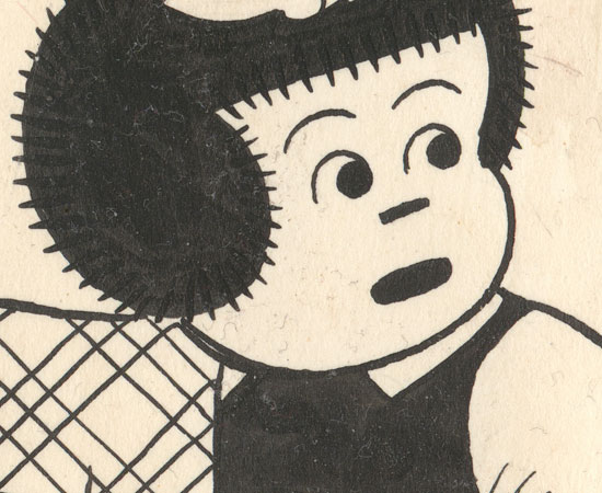
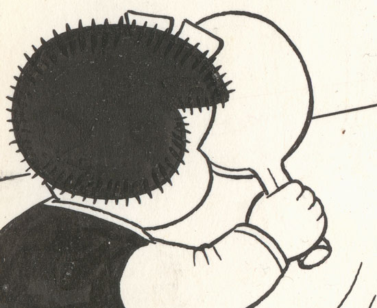
Some details:


Wednesday, May 07, 2014

Art Collection: "Indoor Sports" Drawing By "TAD" Dorgan, 1923

(Click for bigger.)

Isn't it amazing that commercial radio as we know it today still hasn't even reached its centennial? (Note: I'm not talking about the invention of radio, or even the first public broadcasts. I'm speaking of mainstream popularly-oriented radio broadcasting.) The popular art form launched, more or less, in 1920. In 1923, when Tad published this comic panel, the radio craze had reached a fever pitch. People didn't quite understand it, but they wanted it.

Love the gags in this one: "If this is the radio that plays the jazz I'll take it" and "She wanted two wave lengths in case one broke." Good stuff!

Applying the name "The Wiff" to "the best loud speaker" doesn't make sense unless you know that "wiff" is Dorgan's slang term for "wife". Oh, Tad.

"Dumb Dora" is sometimes credited to Tad, but apparently the phrase had been knocking around in vaudeville for some time before becoming hugely popular due to George Burns and Gracie Allen the very same year this cartoon was published. It's likely that Tad picked up the term from them.

And, finally, note the use of Cockney rhyming slang in the caption: Twist and Twirl = Girl.

This is a really nice drawing by Tad, much more careful and finished than the last one I featured here. I love the use of silhouettes in the background. The clothing is sharply observed, and as always, Dorgan has a flair for humorous faces and expressions.

Rather than posting details, I've uploaded a larger-than-usual scan of the drawing (click the small version above).

 Next: Nancy and Sluggo visit the zoo again, always fertile ground for gags.

Tuesday, May 06, 2014

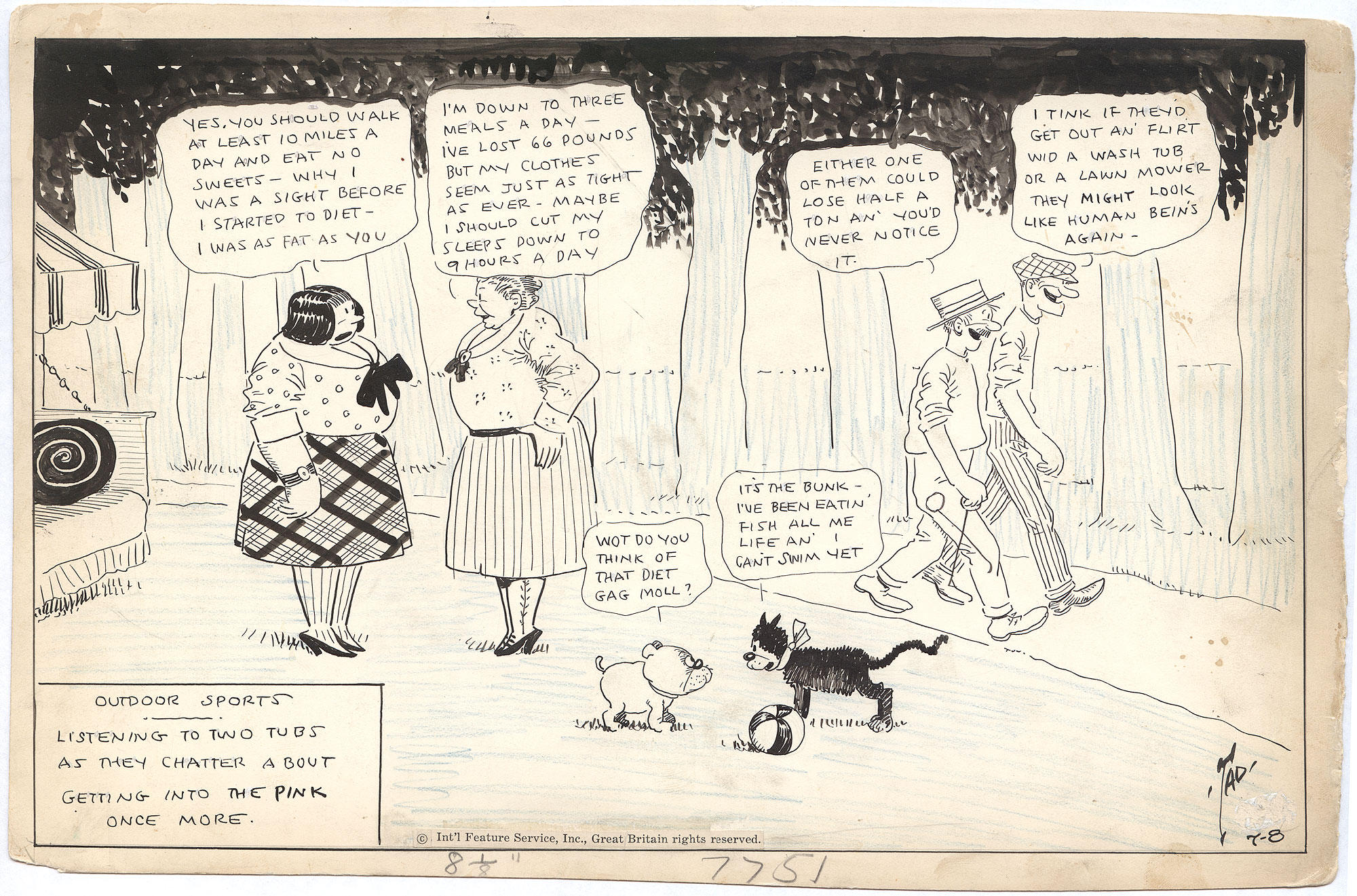
Art Collection: "Outdoor Sports" Drawing By "TAD" Dorgan, 1922

(Click for bigger.)

I just scored three drawings all at once from Heritage Auctions: two Tads and a Bushmiller. Yay!

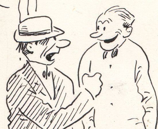
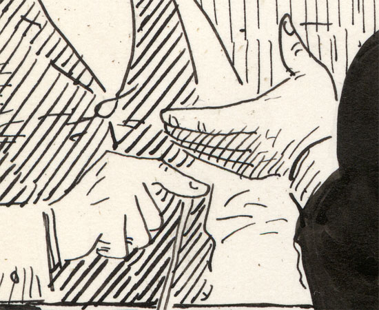
The one shown above, from Summer of 1922, is the least impressive of the batch; it seems to be pretty hastily drawn. Otherwise, it's a classic Indoor/Outdoor Sports panel, with the deluded on one side and the delusion puncturers on the other. I'm afraid women are generally not portrayed very sympathetically by man's-man Tad. They tend to either be in the background or they're awful, brainless chatterboxes. Otherwise, this is a good reminder that dieting gags haven't really changed much in ninety years! Some details:


Below: the guy on the left is an Ice Man (note his tongs in the overall image). This is really sketchy for Tad:


Below: this is about as bad as hands get in Tad drawings:


Next: an early consumer electronics gag!

Thursday, April 24, 2014

Art Collection: Drawing For 11-27-1965 "Nancy" By Ernie Bushmiller

(Click for bigger.)

What a treat: a rare mid-sixties Bushmiller original is absolutely pristine condition. There isn't a hint of yellowing in the Benday overlay, and the board looks practically like it just came off the press:

(Detail of Benday dots with cuts visible, and a little knife scraping on the upper left.)

The gag is so perfectly constructed. At first I wondered why Bushmiller hadn't condensed the strip into three panels, but there's actually no way to do it as economically as he does here. The second panel can't be dropped without damaging the gag.

Irma is doing the classic Bushmiller "head bob" up and down from panel to panel, bouncing the composition forward (see here and here for more examples). Note, too, the subtle way the horizon line leads the eye forward in the first two panels.

The payoff is just glorious Nancy sight gag nirvana.

One thing I love is that Bushmiller used Benday dots for Irma's dress, but did the ultra-laborious "tweed" pattern on Nancy's dress (it's November!) by hand, which is a useful indication of the border between what an obsessive technician is and is not willing to do:


It was tempting to title this "Nancy's Candy Glory-Hole".

And don't even get me started on fences in Bushmiller. You'll have to wait for Mark Newgarden and  Paul Karasik's How to Read Nancy, due to be released, I believe, later this year by Fantagraphics, because evidently it will include extensive Bushmiller fence scholarship. Praise!

Thursday, March 27, 2014

Art Collection: "Judge Rummy" Drawing By "Tad" Dorgan, 1920

(Click for lots bigger.)

Kind of a quickie here, but by now you probably don't need me to tell you the dimensions of this or how it was drawn; it's roughly the same as all the other Tads in my collection. This one was once in the Murray Harris collection, as were several of my other drawings. I assume the notations on the front are his, so I have no reason to doubt the accuracy of the title ("The Judge Hears Wisdom") or the date (November 11, 1920).

This is an above-average Judge Rummy strip, loaded with slang ("Right as a trivet"), almost to the point of incomprehensibility. It's a vaudeville-style divorce gag which I suspect may already have been stale by the time Tad used it, but you never know! It's always difficult to sort out which clichés Tad recycled from the ones he invented himself.

And, of course, I love the double-plop in the final panel.

UPDATE: I thought I'd clarify the final comment from Judge Rummy: "Wins the carving set" refers to a very common prize (sets of carving knives) in raffles, contests, etc. It has the exact same origin and meaning as the phrase "That takes the cake", which is, as you know, still very common today.


Tuesday, January 14, 2014

Art Collection: Drawing For "S'Matter, Pop?" Comic Strip By Charles M. Payne, 1927

(Click for bigger. But before you do, look at the superb rhythm of the black spaces in the thumbnail!)

This pen, brush, and ink drawing on illustration board is rather small for a daily strip, measuring 17.75" x 4.75". There is no detectable pencil underdrawing.

I like weird art, I like weird music, but I tend to collect fairly normal comic art! After all, Tad Dorgan was as mainstream as mainstream got in the teens and 20s, and Ernie Bushmiller was one of the most successful comic strip artists of all time.

But the work of C. M. Payne really satisfies my craving for the unusual and idiosyncratic. He was certainly one of the strangest gag cartoonists of his day, and his career was long. This example of his long-running "S'Matter, Pop?" strip, from 1927, comes from the height of Payne's strange, inscrutable minimalist powers. The drawings are barely there, and the gag is a "do as I say, not as I do" softball, barely even worth commenting upon. But look at how weird and great those scratchy little drawings are, floating around in outer space amongst their blobby, oddly palpable shadows! Click the detail below for a supersized version, and marvel at the expressive chaos:


From what I've seen of its earlier days, "S'Matter, Pop?" was a much more normal "rascally kids" strip when it started, but as it evolved it got increasingly distorted on the one hand, and stripped down on the other, until you're left with the abstract figures and completely undelineated space you see here. Most of the strips I've seen from this period show the father sitting down, because how else could that bizarre figure fit into the panels? But look at the postures, the facial expressions... look at the hands in the last panel! Make no mistake about it: this is a master at work.

There isn't much to read about Payne online, but it seems that his creations eventually got too esoteric and "soft" for the marketplace, and he evidently died poor and forgotten. He left his mark, however: Charles Schulz was a big fan, and frequently cited "S'Matter, Pop?" as a major, formative influence on Peanuts (and, I bet, provided an instructive example of the formal advantages of banishing adult characters from his own work)..

Tuesday, November 26, 2013

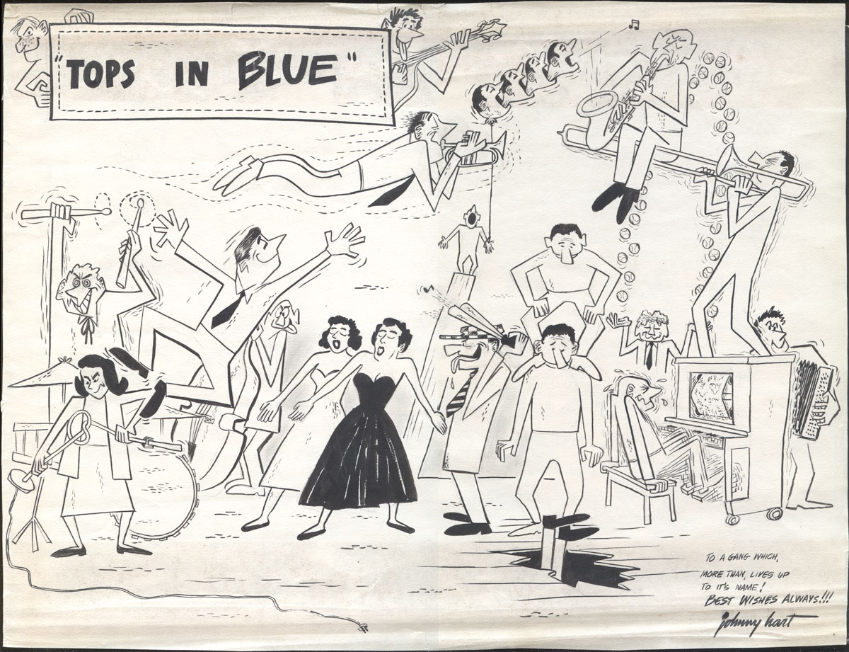
Art Collection: Air Force "Tops In Blue" Illustration By Johnny Hart, Ca. 1953-4 (UPDATED)

(Click for bigger.)

This is definitely one of the most off-the-wall items in my collection of original comic art drawings. It is pencil, pen, brush, and ink on mediocre single-ply paper, measures 11.25" x 14.75", and was drawn by Johnny Hart when he was about 22 years old, just a few years before he created "B.C." and struck it rich.

Johnny Hart served in the Air Force from 1950 until 1954. It was during this time that he had his first cartoons published in Stars and Stripes. Hart served briefly in Korea, but when you read later articles and interviews with the cartoonist, it seems that what he mostly did in the Air Force was sing, dance, and draw cartoons, so perhaps not your typical tour of duty:

When Hart was in the Air Force during the Korean War, he drew cartoons for the Pacific Stars and Stripes, but he also toured Korea with band [sic], Hart doing soft shoe and stand-up comedy and writing the comic songs. He briefly considered comedy and music as a career: after one performance, a member of the audience came up and, saying he had a nightclub in New York, gave Hart his card and insisted that Hart get in touch the instant he got out of the service. But Hart lost the card—and the entree to show business—and wound up at the drawing board instead.

Hart wasn't the only person singing, dancing, and doing stand-up in the Air Force during this period. Colonel Alvin Reilly (from whose estate this drawing comes), in 1953, founded a traveling USAF performing arts troupe called "Tops in Blue" which entertained their fellow soldiers worldwide. The group still exists today, and is now a venerated and prestigious part of Air Force tradition, currently celebrating its 50th anniversary.

Was Johnny Hart a member of Tops in Blue? [UPDATE: No, see below.] It seems likely, although the group isn't mentioned by name in any of the interviews with the artist. How many performing arts troupes could the USAF have during the Korean War? The existence of this drawing certainly implies a close familiarity with the show, and many of the figures look like caricatures. Since Hart left the service in 1954, and Tops in Blue was founded in 1953, it's easy to date this portrait to those years.

What I love about this drawing, besides its overall exuberance, is that it's always interesting to see the crude work of a young cartoonist who hasn't really found his own style yet. It's fascinating to me that Hart here is obviously inspired by commercial illustration, rather than by comic strips. This composition, with its angular figures, hard contours, goofy surrealism, and stylish dotted lines, looks like something you'd see on the back cover of an RCA jazz record from the period, or something from Esquire. Gone, Daddy, gone! All the same, you can spy little glimmers of Hart's style to come; the face in the upper-left corner looks very "B.C." to me.

Clumsy as it is, this fun drawing packs a bit of a historical punch as both the early work of a famous cartoonist and as a document of the first year of an Air Force tradition. Plus: drag performers!

UPDATE: I received this note from Jeri White, current production director for Tops in Blue:
Johnny Hart drew the picture after seeing a Tops In Blue show as his reflection of what he saw during the show. We actually have a signed copy of the art hanging in our Production Center at Lackland AFB.

Monday, October 07, 2013

Art Collection: "Nancy" Drawing For 02-11-53 By Ernie Bushmiller

(Click for bigger.)

"My name is Ernie Bushmiller, king of comic strip artists," this drawing shouts. "Look on my works, ye Mighty, and despair!"

Despite its somewhat battered condition, this new acquisition is instantly my favorite Bushmiller. The final panel is such a tour de force of technical and compositional mastery that it practically hurts to look at it. As I've said before, original Nancy drawings from the 50s are scarce, so this was a lucky get.

Questions for discussion:

  • Which panel do you think Bushmiller conceived/drew first?
  • Are the first two panels useless space fillers? Why or why not?
  • Why didn't Bushmiller use Benday/Zip-a-Tone for the table's shadow? Was he insane or just fastidious?

Some details:


The detail above just kills me; it's the only scraping/correction in the entire drawing. Viewed so close, it doesn't seem to make any sense, but graphically it's ingenious and crucial for clarity.


Friday, October 04, 2013

Art Collection: Two "Judge Rummy's Court" Comic Strip Drawings By "Tad" Dorgan, Circa 1919

(Click either for bigger.)

It's a Tad twofer! I'm not sure of the date on either of these, but the song quoted in the one shown above was copyrighted in 1919, and that's pretty much what I would have guessed. The Judge Rummy comic strips didn't really change much from 1915 until Tad got bored with them in the mid 1920s, so they're hard to date on style.

Both of these are... esoteric. I don't really "get" either of them. The gag in the one above seems to be that the defendant would rather go to jail for a short spell than back to his wife. Har har. The one below just seems to be about the cop not making any sense:


Love the drawings in both of these. Tad was so good at facial expressions and body language. And speaking of body language, both of these end with "plops." Fun! I do suspect that Tad invented the "plop" in the final panel, still so beloved of cartoonists to this day.

Note again that both of these have titles: "He Didn't Want a Comeback" for the top one, and "That Made it Harder" for the second one. The series never really had a consistent title in all papers.

Next in the art collection: a superb but somewhat battered "Nancy" from 1953!

Monday, August 26, 2013

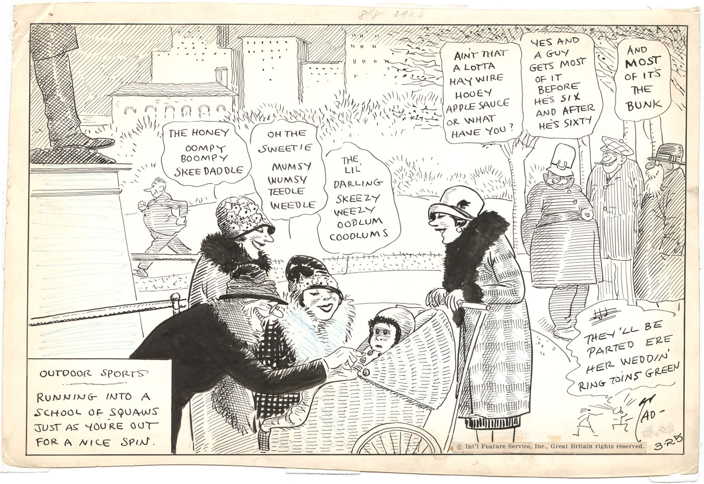
Art Collection: "Outdoor Sports" Drawing By "TAD" Dorgan, Ca. 1918-20

(Click for bigger.)

Annnnd another great Tad drawing enters the Peteykins collection of comic strip art. Yay! This one follows the same specifications as the others I featured here: brush, pen, ink, and blue pencil on cotton rag illustration board, with the image size measuring 8" x 12".

The last Indoor/Outdoor Sports panel I posted showed the artist in a lazy mood, cutting corners and, as the saying goes, phoning it in. That's certainly not the case for this drawing, which is an absolute riot of all of Tad's different hatching, crosshatching, stippling and shading techniques. His graphic shorthand for "wicker" is economical and brilliant. Furthermore, unusually for the artist, this is an open-air park scene, with a view that goes far into the distance, trees, a fragment of a statue, buildings, etc. It's a nice contrast to the "shallow stage" compositions upon which Tad usually relies.

The gag is simple and funny: a group of gentlemen observe a gaggle of gals positively assaulting an infant with baby talk. Feeling superior, the men comment on the women's silliness, evidently  unaware that their own lingo is as opaque and ridiculous as the goo-goo noises they're disparaging. The bewildered look on the baby's face is pretty hilarious.

I love the little song Tad quotes in the corner gag. I did some research, and either the artist made this song up off the top of his head, or it's a vaudeville obscurity which hasn't survived.

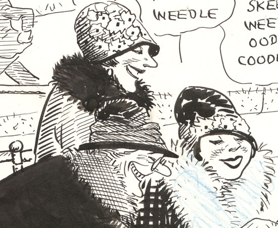
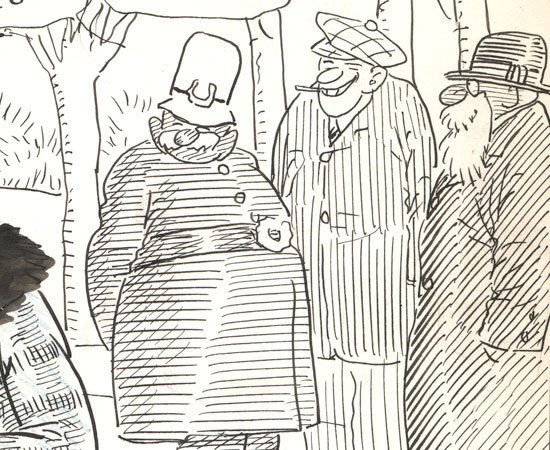
Here are a couple of nice details:


Thursday, August 15, 2013

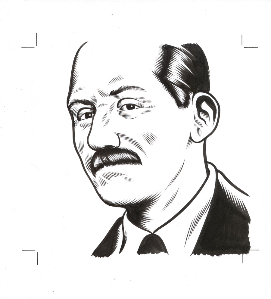
Art Collection: Portrait Of Nathanael West By Charles Burns, 2009

(Click for bigger.) 

This drawing is brush and ink on illustration board with traces of graphite underdrawing. The board measures about 9" x 8", and the image area is 6" x 6".

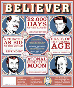
Cartoonist Charles Burns created this portrait of Miss Lonelyhearts and Day of the Locust author Nathanael West for the cover of the June, 2009 issue of McSweeney's The Believer magazine, which featured Jonathan Lethem's wonderful essay on West. Here is how the drawing, flipped and somewhat unhappily spot-colored and squeezed into a circle, was used on the cover:


Burns created hundreds of portraits for the magazine, and these were recently exhibited at the Adam Baumgold Gallery in NYC (see their wonderful webpage for the show here). I've long been a fan of Burns' sharp, clean images and dazzling technique, so I was thrilled to obtain this drawing from the exhibition. It was so hard to choose! Most of my first picks were already taken (I would have loved the Susan Sontag). In the end, it came down to a choice between the Sweet Valley Twins and Nathanael West, and I suppose the issue of "literary merit" tipped the scales in favor of the latter.

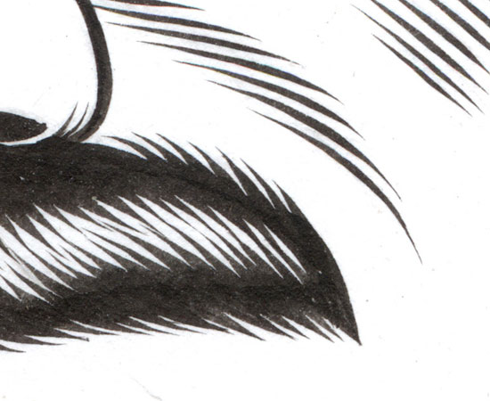
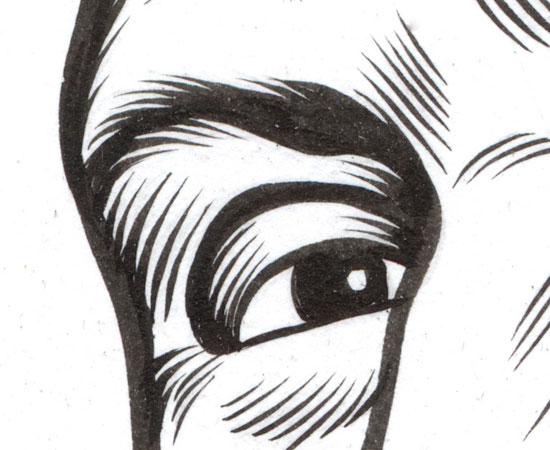
It's hard to resist including some close-up details which show off Burns' meticulous "feathering" brush technique:


Beautiful stuff! To some, I suppose, Charles Burns' work looks static, almost machine like, to which my response is, "When did we decide those were bad things?" Of course, this attitude isn't surprising from a collector of Ernie Bushmiller drawings. Furthermore, I don't believe Burns worked directly from a photographic source; the drawing doesn't slavishly follow any photograph of West I've seen, but the resemblance is perfect nevertheless. Charles Burns is just so good that he makes it look easy. You can read my 1995 interview with him here.

Inspired by the drawing, I read Nathanael West's 1939 novel Day of the Locust for the first time in decades, and was thrilled to realize that it truly is one of the Great American Novels™. It's a breezy, fun read, yet dripping with poison, and filled with nothing but hateful characters who all hate themselves as they stumble around numbly, with varying levels of success, through the gimcrackery of the Hollywood landscape. I was surprised to realize that West had written succinctly about this concept I wrote about a couple of years ago. It was also interesting to become aware of the long shadow West's mean-spirited novel cast over pop culture in ensuing decades: David Lynch's Mulholland Drive and Inland Empire, the Coen Brothers' Barton Fink, and Michel Hazanavicius' The Artist all owe substantial debts to Day of the Locust, as do countless other tales of Hollywood treachery and phoniness.

But as scabrous as West's observations are, he also includes passages of haunting surreality, and occasional moments of non-ironic beauty:

It was full spring. The path ran along the bottom of a narrow canyon and wherever weeds could get a purchase in its steep banks they flowered in purple, blue and yellow. Orange poppies bordered the path. Their petals were wrinkled like crepe and their leaves were heavy with talcumlike dust.

They climbed until they reached another canyon. This one was sterile, but its bare ground and jagged rocks were even more brilliantly colored than the flowers of the first. The path was silver, grained with streaks of rose-gray, and the walls of the canyon were turquoise, mauve, chocolate and lavender. The air itself was vibrant pink.

They stopped to watch a humming bird chase a blue jay. The jay flashed by squawking with its tiny enemy on its tail like a ruby bullet. The gaudy birds burst the colored air into a thousand glittering particles like metal confetti. 

I have considerably fewer good things to say about John Schlesinger's bloated, tacky film adaptation of Day of the Locust from 1975. It's worth seeing, because it has aged badly in a campy way, contains some ludicrously expensive and complicated sequences, and features some incredible performances. Those incredible performances are, unfortunately, by actors who have been badly, elaborately miscast in their roles, thereby totally ruining the movie. Karen Black is a fun, daffy and dumb blonde who eventually turns mean, but her character in the book is, besides being twenty years younger, a calculating, conniving bitch right from the get-go, stupid yet anything but innocent. Donald Sutherland is similarly impressive yet, conversely, about 20 years too young for his role. The only successful casting in the film consists of Billy Barty as an aggressive dwarf (hardly a stretch), and little Jackie Earle Haley as the creepily androgynous, overtly horrible child actor who becomes the unexpected focus of the film's climax.

Any attempt to turn Day of the Locust into a commercial film is doomed to fail, because the central point-of-view character, Tod, is a jerk who never actually does anything other than think about how much he hates all the other awful characters in the book. He walks around the set; he thinks about working on his painting; he observes a cockfight; he harbors violent rape fantasies towards the "heroine." The plot of the novel is one of steadily escalating pathetic failures with a sickening payoff, hardly the setting for a celebrity-studded big studio extravaganza, and yet that's what Schlesinger tried to do. A for effort, I guess!