(Click for bigger.)
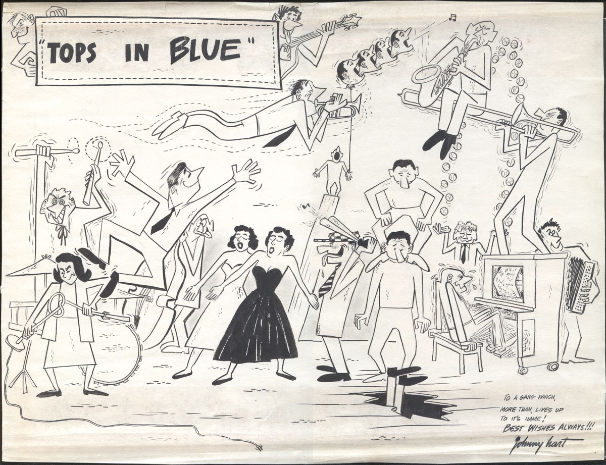
This is definitely one of the most off-the-wall items in my collection of original comic art drawings. It is pencil, pen, brush, and ink on mediocre single-ply paper, measures 11.25" x 14.75", and was drawn by Johnny Hart when he was about 22 years old, just a few years before he created "B.C." and struck it rich.
Johnny Hart served in the Air Force from 1950 until 1954. It was during this time that he had his first cartoons published in Stars and Stripes. Hart served briefly in Korea, but when you read later articles and interviews with the cartoonist, it seems that what he mostly did in the Air Force was sing, dance, and draw cartoons, so perhaps not your typical tour of duty:
When Hart was in the Air Force during the Korean War, he drew cartoons for the Pacific Stars and Stripes, but he also toured Korea with band [sic], Hart doing soft shoe and stand-up comedy and writing the comic songs. He briefly considered comedy and music as a career: after one performance, a member of the audience came up and, saying he had a nightclub in New York, gave Hart his card and insisted that Hart get in touch the instant he got out of the service. But Hart lost the card—and the entree to show business—and wound up at the drawing board instead.
Hart wasn't the only person singing, dancing, and doing stand-up in the Air Force during this period. Colonel Alvin Reilly (from whose estate this drawing comes), in 1953, founded a traveling USAF performing arts troupe called "Tops in Blue" which entertained their fellow soldiers worldwide. The group still exists today, and is now a venerated and prestigious part of Air Force tradition, currently celebrating its 50th anniversary.
Was Johnny Hart a member of Tops in Blue? [UPDATE: No, see below.] It seems likely, although the group isn't mentioned by name in any of the interviews with the artist. How many performing arts troupes could the USAF have during the Korean War? The existence of this drawing certainly implies a close familiarity with the show, and many of the figures look like caricatures. Since Hart left the service in 1954, and Tops in Blue was founded in 1953, it's easy to date this portrait to those years.
What I love about this drawing, besides its overall exuberance, is that it's always interesting to see the crude work of a young cartoonist who hasn't really found his own style yet. It's fascinating to me that Hart here is obviously inspired by commercial illustration, rather than by comic strips. This composition, with its angular figures, hard contours, goofy surrealism, and stylish dotted lines, looks like something you'd see on the back cover of an RCA jazz record from the period, or something from Esquire. Gone, Daddy, gone! All the same, you can spy little glimmers of Hart's style to come; the face in the upper-left corner looks very "B.C." to me.
Clumsy as it is, this fun drawing packs a bit of a historical punch as both the early work of a famous cartoonist and as a document of the first year of an Air Force tradition. Plus: drag performers!
UPDATE: I received this note from Jeri White, current production director for Tops in Blue:
Johnny Hart drew the picture after seeing a Tops In Blue show as his reflection of what he saw during the show. We actually have a signed copy of the art hanging in our Production Center at Lackland AFB.
4 comments:
That's a super-fun picture! The first thing I saw, and you referred to it as well, was the dotted line. I've always been a sucker for the broken line used like that. It just elevates illustration from the 50s (and onward), somehow a mark of that casual/sophisticated play that the 50s was so good at/invented.
Yeah yeah yeah, it's just a stoopit broken line, but - WOW - does it ever do a good job at the job it does so well!
Really glad you appreciate that, anonymous. I love the use of broken lines in 50s illustration, too. That's one of the things that drew me to this piece.
More primitive than B.C.
I love this! "Exuberant" is exactly the word that came to mind. The maniac drummer especially. I love the commercial illustration style too. I'm a sucker for its idealism.
Post a Comment