(Click any image for bigger.)
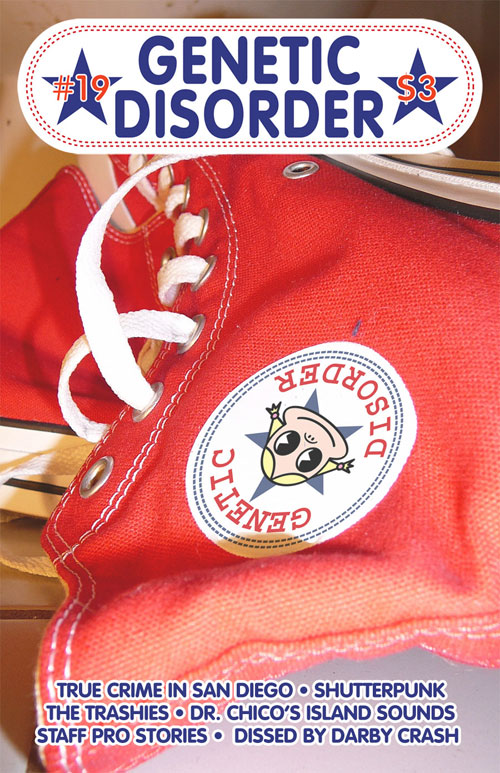
This is my most recent design for Larry Harmon's Genetic Disorder magazine, published in Spring of 2008. I wonder if there will ever be another issue? Today, with the blogs and the youtubes and the facebooks and whatnot, is it worth the effort to make a print magazine like GD? (The answer is YES.)
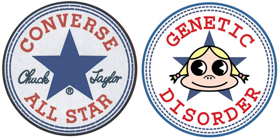
For this issue, I chose photography again, and illustration was kept to a bare minimum. I wanted the front cover to look grimy, but the newness of the shoes kind of undermines that. One the other hand, the shoes' newness made it really easy to Photoshop-swap the Converse logo with Genetic Disorder's beloved Li'l Kunty version. Here's the simple design ripoff:
The back cover, originally intended for the front, is an exaggerated illustration of a real story in the issue about a San Diego grocery clerk who was caught sticking pins in doughnuts:
I went to at least three different doughnut shops before finding the most photogenic sprinkles. Considering that I took that photo in my bathroom with two table lamps for lighting and a fake sky backdrop, I think it came out pretty well, but it somehow just... misses.
Larry and I bumped that image to the back cover for a couple of reasons: first, we didn't want to have two issues in a row with food on the cover. Second, we both just loved having the Chuck Taylors on the front.
It isn't because Chucks are such a classic punk rock icon, but that made for perfect camouflage. The issue is heavy on retro-punk, so they work well for that. What made the shoes the perfect choice, though, is that the most interesting story in the magazine was about Kenneth Bogard, a Pacific Beach musician with a double identity who headed a cheesy Jimmy Buffet-esque good-times beach band (Dr. Chico's Island Sounds!) on weekends and was a violent serial rapist on weekdays. On stage he wore Hawaiian shirts and his signature item of apparel... red Chuck Taylor high-tops. Showing those shoes (bought especially for the cover!) discarded on a bathroom floor made it almost like a crime scene photograph. So the idea was that anybody reading the magazine would be treated to the cover design suddenly changing in meaning, from fun and innocent to sinister and queezy, after reading the article.
I don't think this is the most attractive or well-designed cover I did for Larry, especially with the deliberately bad shot of the shoes, but I think it's the most interesting conceptually.
And, finally, I also contributed a silly picture of Patricia Hearst wearing a Ronald Reagan mask for the inside of the magazine, but I can't find a copy of it anywhere.
I hope to work with Larry again! I'm proud of this series of covers, each more or less flawed yet more or less successful at the same time. And I love that Larry left me completely alone to do each of them, yet provided crucial inspiration for every single one. The key to it all: we barely know each other!
Part one is here, two is here, three is here, four is here, and five is here. Purchase copies of these wonderful zines here.


1 comment:
Why didn't you go all-in on the shoe logo and replace the script "Chuck Taylor" with "Lil Kunty"?
Post a Comment