
(Click for HUGE file. It is impressive.)
Today's selection from my collection of comic strip art is the original drawing for a 1977 Family Circus panel by Bil Keane, executed in graphite, pen, brush, and ink with blue pencil and paste-up on a 8.75" x 11.5" illustration board.
I have a complicated relationship with Family Circus (DON'T WE ALL?). It was one of my favorites when I was very young, right up there with Nancy and Peanuts. As I grew older, I hated it more and more. It was so corny! So obvious! Later, as I moved into my "ironic" phase, I loved it all over again for its idiosyncrasies and... well, because it was so corny and obvious.
Today, in my post-ironic phase, I can't say I love Family Circus, but it never fails to impress and even fascinate me. Yes, it is idiosyncratic (why are the kids always drawn with only one nostril?), corny, obvious, and sometimes downright bizarre, but it's also a fantastically well-crafted feature cunningly targeted at two groups which don't generally share tastes in anything: the very young and the very old.
I don't have much to say about the quality of this drawing. It's perfect. That is a solid figure, weighty and logically constructed, and the setting is carefully laid out and rendered with an architect's exactitude. The pattern of the shirt is skilfully and convincingly wrapped around the figure.
What really impresses me is Keane's masterful ability to compose in a circle, a deceptively easy task. The figure is a perfect little "x" shape, and it has been given bold, solid blacks to make it stand out. Rather than placing the figure in the exact middle of the circle, Keane shifts it a little to the left and then balances it on the right with the vertical of the doorway. Then everything is locked in place with further simple horizontals and diagonals. This minimalist but intricate interplay of shapes and forms creates a stable composition which does not "roll," as unsuccessful circular works tend to do. Despite all the carefulness and precision, the whole thing comes across as uncluttered and effortless.
Let's look at some other famous, successful circular compositions. First up is the Adoration of the Magi tondo by Fra Angelico and Fra Filippo Lippi from the mid-15th century:

(Image courtesy the National Gallery of Art, Washington. Click for bigger.)
Next is Michelangelo's mirthless Doni Tondo from the Uffizi, ca. 1507:

(Image via. Click for bigger.)
Talk about effortful! Michelangelo locks down his circle with a wide horizontal strip of figures and a ledge broken by an even wider vertical tower of figures, anchored by the equilateral pyramid of the Madonna. There's simply not much happening in the upper and lower left and right. What's really interesting is how the artist uses the illusionistic depth axis (the passage of the child from Joseph to Mary) to further stabilize the composition.
But the ultimate circular painting of the Renaissance has got to be Raphael's sublime Alba Madonna, ca. 1510:

(Image courtesy the National Gallery of Art, Washington. Click for bigger.)
What a contrast! Here, everything is breezy and, compared to Michelangelo, nothing seems belabored. Nothing is symmetrical but everything is balanced. Whole volumes could be written on the perfection of this composition, and frankly, I'm not worthy.And finally, one of the 20th century's greatest compositional masters, Roy Lichtenstein, takes on the circle in one of his great Mirror prints:
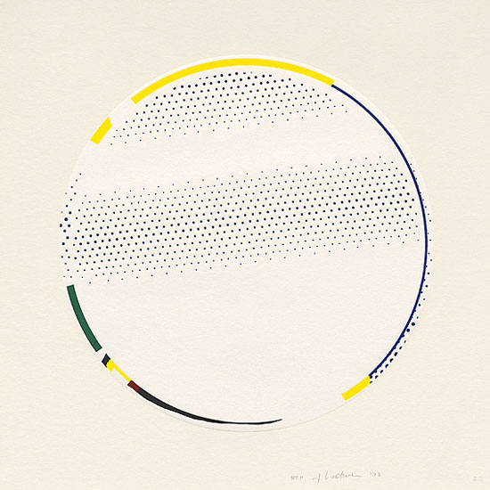
(Image via National Gallery of Australia)
Before this gets too ridiculous (this was supposed to be about Family Circus!), suffice it to say that making art in a circle is tricky, and it takes a great artist to master it, and for that alone Bil Keane, who did it perfectly day after day after day for decades, deserves our respect.
Otherwise, LOL, what's up with that shirt? Are you kidding me?
14 comments:
The greatest piece of circle-shaped art is actually the Warner Bros. Merrie Melodies cartoon logo.
Now I must read family circus everyday to look for the single nostril.
Terrific post! Totally agree about the Michelangelo piece looking forced and awkward.
But curse you for pointing out the single-nostril thing. Now I'm going to obsess about that for the rest of my life.
I'm with the others. One nostril? Who knew? hee hee.
I liked this analysis. I learn so much from reading your blog, and that's why I enjoy it. Circle art is amazing!
Yeah, you'll never be able to "un-see" the single nostril thing. His son does it, too. I've only seen one or two panels where a kid has two nostrils, and both involved nostril-specific gags.
My theory is that he only put one nostril so that the kids didn't end up looking (more) like little pigs.
I think The Family Circus was one of the first encounters I had with "recurring gags" as a very young person. Specifically, I'm thinking of the "Ida Know"/"Not Me" (and there's a third I can't remember, and possibly a one-off fourth) appearances, as well as the follow-the-path ones that are an ADHD traipse through the yard/neighborhodd/mall as one of the kids gets from point A to point Z by way of the rest of the alphabet.
But I always did admire the roundness and smoothness of his figures, even as I outgrew the material. (And when I start finding it funny again, well, I'll make sure I have a will).
But I think I most enjoy it now when your erstwhile co-blogger, Josh/The Comics Curmudgeon posts his usual fly-in-amber/"Keane Compound" jokes about it.
Oh, and that is probably one of the nicest Raphael's I've ever seen. Her arm casually resting on the, er, wood, with her finger conscientiously keeping her place in the book. And the way her and the infant's gazes travel to the viewer's left, tracking the beautiful blue/green horizon toward the . . . Church?
Was this an allegory about Paul? My Jewish education falls rather short at the New Testament, but the way the woman (Mary?) and baby (Jesus?) is handing the cross to the other boy with the building in the background. Is Paul the one they called the Rock or something, "on which the Church was built?"
The weren't contemporaries of each other, Paul coming much later than Jesus, but if it's an allegory (which, otherwise why would the baby Jesus have a cross at that age?) it wouldn't matter much.
That's the infant John the Baptist in the Raphael, as indicated by his costume. The conceit is that the Christ child is accepting the cross from J the B (whose role was to pave his way), and thus acknowledging and accepting his fate willingly. Crazy kids!
The thing that caught my interest was Joseph as an old man. In all movie and TV depictions, Joseph and Mary are a young couple, but there is a post-biblical work that says Joseph was about 90. It's still controversial to this day.
Okay, I'll admit it. That and the one nostril thing.
Joseph is rarely, if ever, depicted as a young man in Renaissance paintings. I can't think of a single example.
You have a great eye. Can't wait for your analysis of a "circular" painting of Condi as a modern Virgin Mary that is bound to appear one day.
I know you're big on Bushmiller (and rightfully so), but Keane was a constant marvel. The strangeness of his never evolving 1962 view of middle class America was always a joy and a wonder. When he ultimately died a few years back, so did JFK's New Frontier.
Very interesting. I love a blogge that examines the artistic relationship between Bil Keane and Michelangelo.
I was put in mind of Aaron Schock's completely non-gay checkered shirt.
Post a Comment