Wednesday, November 29, 2023
Saturday, July 18, 2015

Thursday, July 16, 2015

Friday, July 10, 2015
Monday, July 06, 2015
Art Collection: "Indoor Sports" Drawing By Tad Dorgan, Ca. 1923
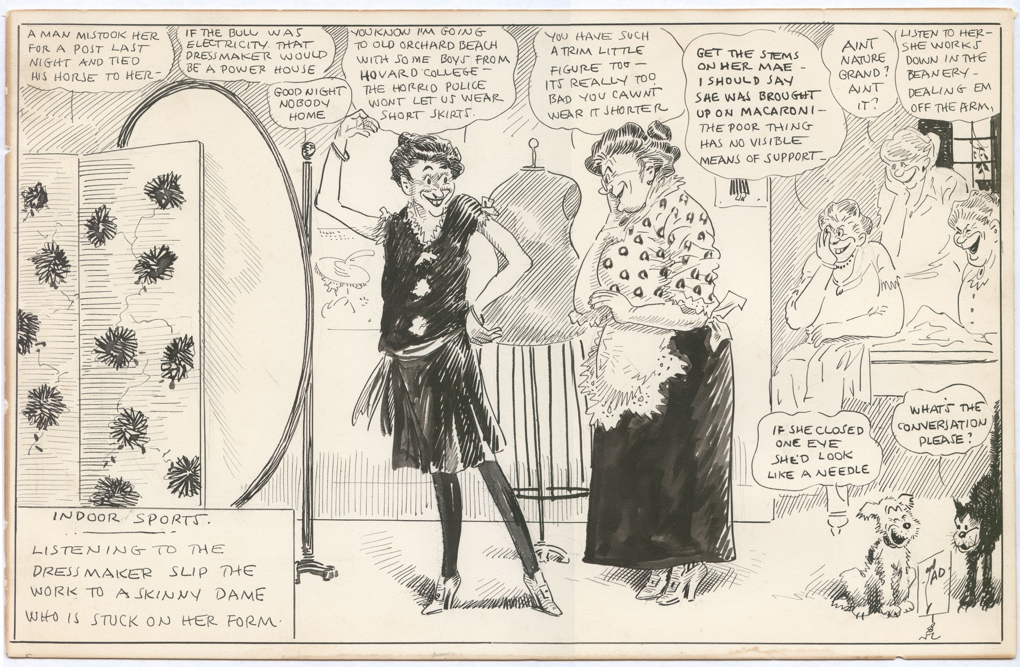
(Click for a lot bigger.)
It's been a while, but I've acquired a new "Indoor Sports" drawing by the prolific Thomas A. "TAD" Dorgan, and this one is a rarity: an all-female scene. Tad's cartoons usually took place in a man's world, so this one is a real treat.
The scene is a clothing store for ladies, and the central figure is trying on a bathing costume; yes, that is a swimsuit, complete with stockings! Tad's scorn is aimed primarily at the customer, who seems to think she's a real beauty despite being what would be seen at the time as grotesquely thin (this is almost a half-century before Twiggy, remember). His secondary target is the insincerity of the dressmaker, really laying it on thick to close the sale. Crowding the rest of the cartoon is Tad's typical Greek chorus of scornful onlookers.
The drawing is undated, but it's easy to narrow things down to a couple of years thanks to the style of the bathing costume. In the 1920s, standards of bathing suit decency quickly relaxed, and one-piece suits had become de rigeur by the second half of the 20s. The customer's comments show that shorter skirts were coming in, but still resisted in some areas. Furthermore, "Ain't Nature Grand" was a popular song published in 1921. All these points indicate a likely date of 1922-25.
Most of the slang in this one is pretty easy to decode. "Pins" were legs, and "dealing 'em off the arm" is an old term for waitressing, but otherwise everything is fairly straightforward. "What's the conversation" is early 20th century for "WTF?" and would remain a popular term for years to come.
Stylistically, this is top-notch Tad, with lots of brushwork, pen hatching, patterns, a well thought-out space and plenty of figures and objects. He kind of loses it on the customer's upraised arm, but I'll forgive him that, because the pose is hilarious. When Tad spent more time on a drawing such as this one, it really shows.
Click the "Tad Dorgan" tag below for LOTS more of his work.
Tuesday, June 23, 2015
Art Collection: Magazine Drawings By College Student Mort Walker, 1947-8, Part Two
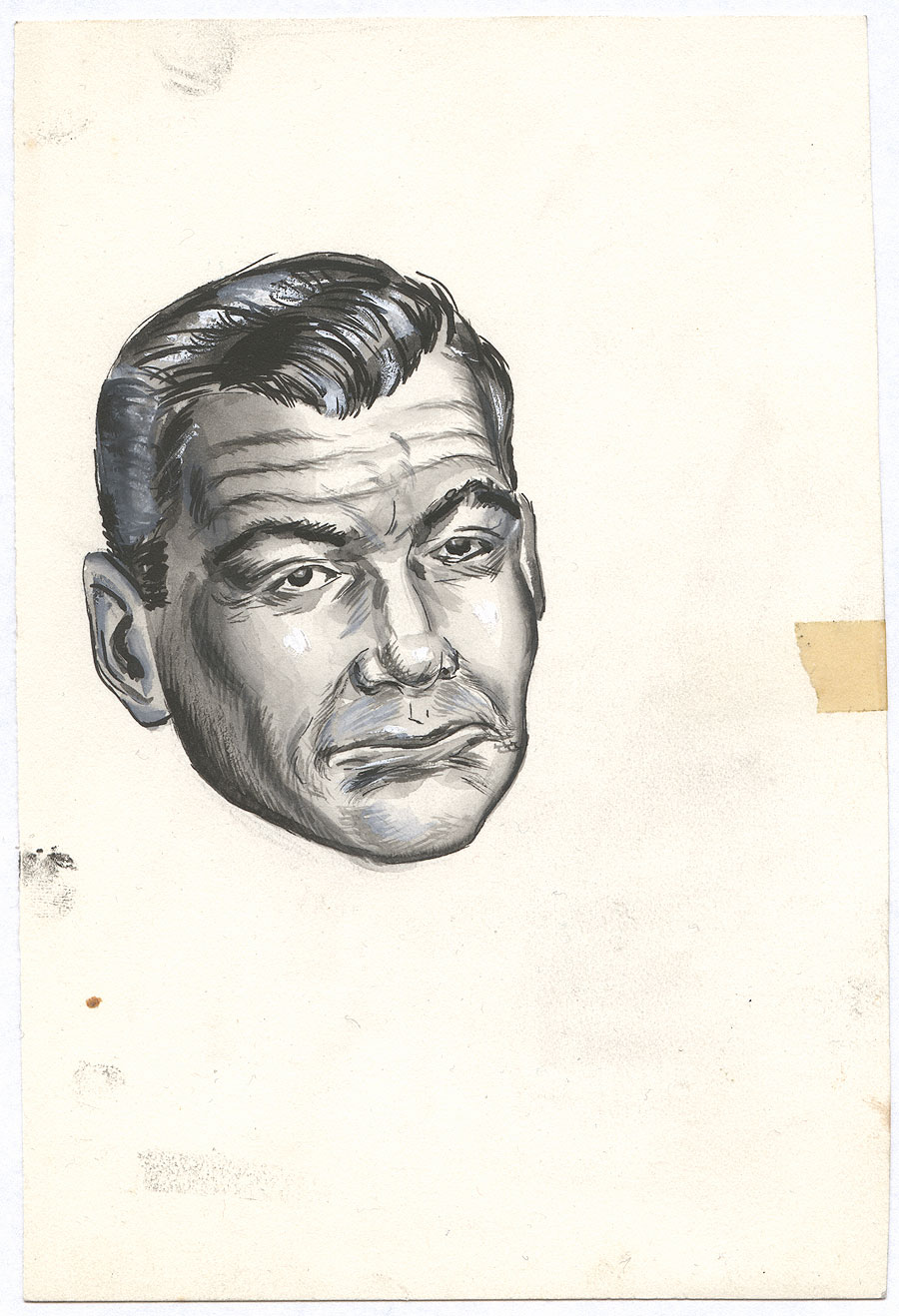
(Click any for bigger. Recommended!)
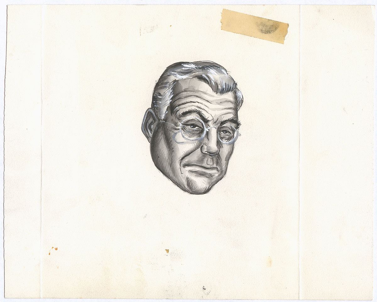
More fun college art from Mort Walker, drawn for the University of Missouri's "Missouri Showme" magazine. First up are two superbly competent deviations from Walker's "big foot" cartoony style, realistic portrait heads (unlabeled, alas) executed in brush, pen, and ink washes with white highlights. Very nice work, if a bit wooden. One can sense the laborious nature of these drawings, and they seem like more of an assignment than anything. Perhaps they were!
Now back to the more silly work we'd expect from Walker, another ad for Charlie's Café:
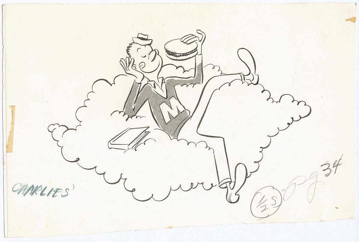
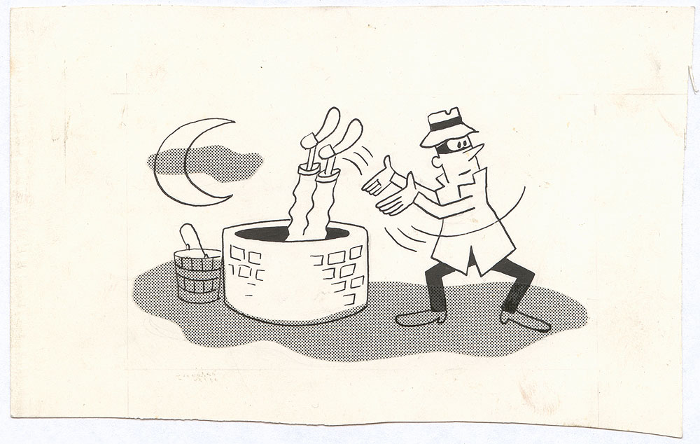
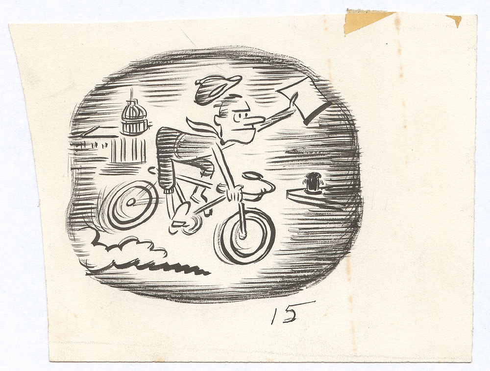
I really like his "raggedy" use of dot screens, although it does verge on sloppy in some cases. More fun spot illustrations:
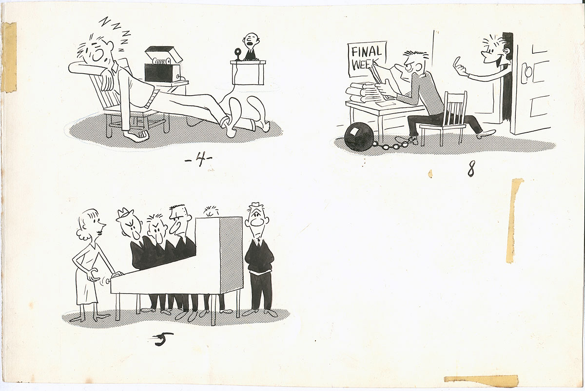
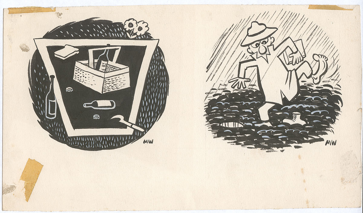
His love of drawing people in humorous lounging/sleeping positions would come to serve him well in Beetle Bailey!
These are drawings of the UM mascot, Truman the Tiger:
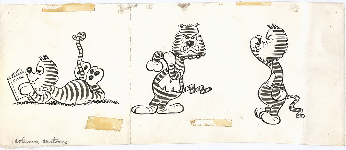
Clearly Walker had no future as a "funny animal" cartoonist, but he gave it the ol'... college try!
And that concludes this episode of "Before They were Famous". Really glad I bought these fun drawings.
Thursday, June 18, 2015
Art Collection: Magazine Drawings By College Student Mort Walker, 1947-8, Part One

(Click any for bigger. Above: ad drawing for Charlie's Café.)
I love seeing the early, pre-fame work of well-known cartoonists. It's fascinating to see them groping for a style. These drawings were executed by Mort Walker, later the creator of Beetle Bailey, Hi and Lois, Sam's Strip, and others, for his college magazine, the Missouri Showme, when he was a student at the University of Missouri in 1947-8.

(Ad drawing for Charlie's Café.)
He's got a way to go, however. For instance, I find his failure to cut out the feet and bucket from his Zip-a-tone, above, to be almost inexcusable.
Another hallmark of student work is experimentation with technique and style. Above, he's used horizontal lines in an interesting way. Below, in both drawings, he's using white paint to achieve certain effects. On the left he's experimenting with a modernist faux-woodcut style in a drawing which reminds me very much of Wanda Gag's work.
Walker was familiar with modernism, and even did a spot-on Picasso parody (with a REALLY dirty "cherry" joke) for the cover of the magazine, a transgression which earned him a suspension as editor.
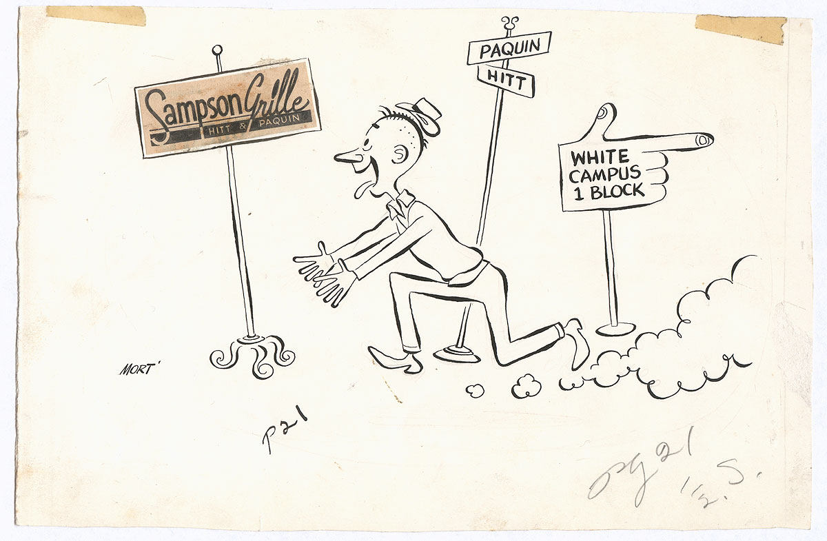
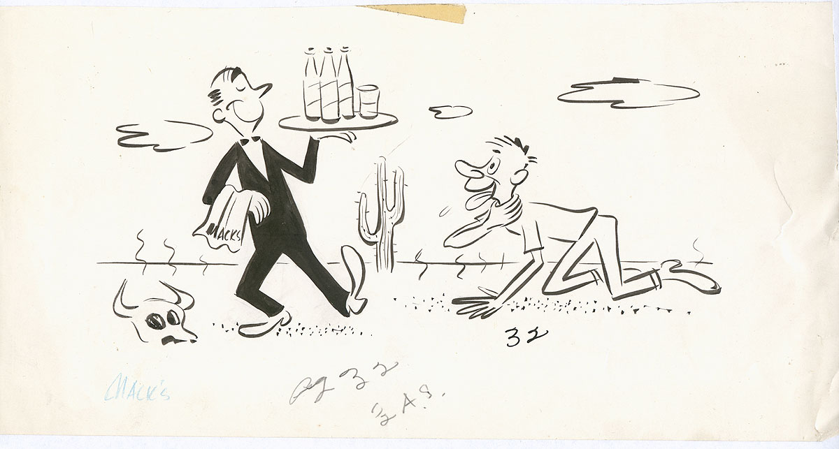
(Ad for Sampson's Grill.)
You can read more about Mort Walker and the Missouri Showme at the link above, at Mort Walker's website, at the Columbia Daily Tribune, and at UM's website.
More in a day or two!
Subscribe to:
Posts (Atom)