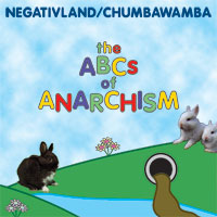
What happened next was that Mark really loved how the artwork was looking (find me an illustrator who can resist such praise from a client), so he wanted more of it. He now wanted the cover to be four squares in a row, accordion folded, with art on one side and text on the other side. So now I really had to double the length of the artwork once again. I still wanted to show a continuous Teletubby-inspired landscape, but just having more rolling hills and flowers seemed like a cop-out. What else could I add?
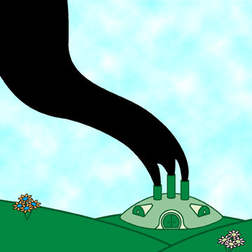
Inspiration arrived in a CD of rough mixes and fragments of the Negativland audio for the album. There was a lot of stuff about polluted water and factories, so that gave me the idea of showing a factory in the shape of the Teletubby house. My first rough try was feeble:
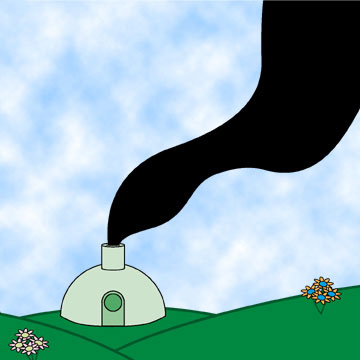
The revised version is modeled much more closely on the Teletubby house, and is much better (excuse the flop):
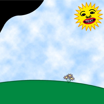
For the third panel, I wanted to include the Teletubby "sun with a face," but with a face based on the front cover of Chumbawamba's boffo smash, Tubthumper:
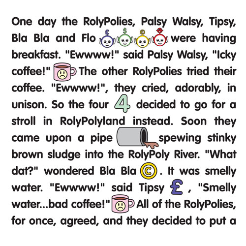
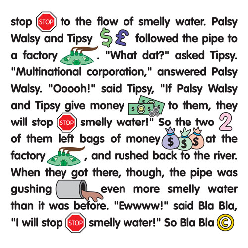
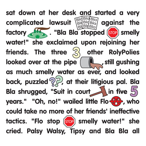
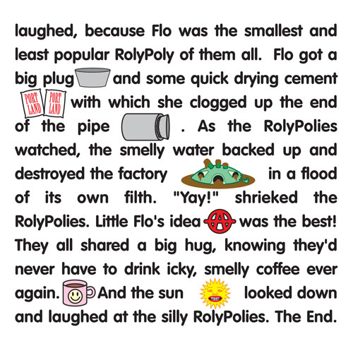
There was too much empty space, and I couldn't figure out how to fill it. But then I got the best idea: I suggested to Mark that there was now ample room on the artwork side to include all the credits they were originally going to put on the back of the insert. My new idea for the reverse side was to write and illustrate a "Highlights for Children"-style picture story which could weave together all the political and satirical themes in a story starring our Teletubby characters, which I would call "The RolyPolies, " thus making their use all the more obviously parodic and, therefore, more lawsuit-proof. Everybody was happy with this idea, so this is what I came up with:
Next I had to round up some photographic images of real bunnies, just as the rabbits on the Teletubbies were the only "real" things. I particularly wanted to find an image of rabbits having sex for the back cover, and it says a lot about the internet in 1998-9 that I was unable to find a suitable one on the web. I had to buy a rabbit manual at a pet store to finally find a good one:
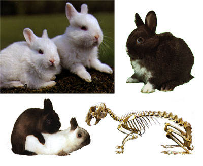

The rabbits in the image above, by the way, are place-holders; somebody else ended up placing the bunnies for me later.
I also put together the back cover image for the CD. Here's the first attempt:
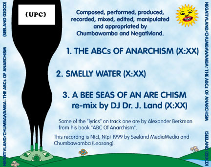
And then more-or-less the final design, with provisional type:

(Click for larger)
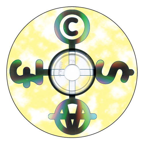
The CD itself:
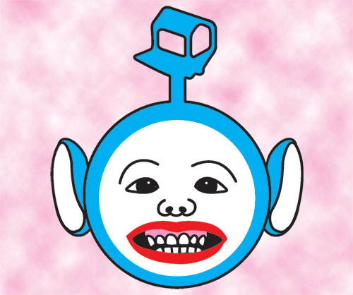
And the image beneath the clear plastic tray behind the CD, combining the Teletubby head, the Chumbawamba face, and Negativland's logo sprouting from the ghastly creature's head:
So anyway, that ended up being a LOT more work than what I first signed up for, considering that I first thought I was simply going to provide one 5" x 5" image. I wouldn't say I was a beginner in 1999, but I sure wasn't advanced enough for this project. All in all, however, I'm still really pleased with the candy-like end product, so cheerful and (mostly) innocent looking. I wanted to create a Teletubby vibe and I think I at least accomplished that. I don't think I'd do a much better job today; maybe the drawings would be more refined. I'm not wild about the Chuimbawamba face.
The CD didn't have much of an impact, even by Negativland's fairly cultish standards. I think they manufactured a shitload of them, thinking all of Chumbawamba's new fans would leap on the release. Negativland openly admitted to a purposeful intention to piggyback on the success of their British friends, hot on the heels of Chumbawamba's unexpected massive worldwide #1 hit. Too bad that once the CD came out, people had had it up to HERE with "Tubthumping."
You can get it still, brand new, for crazy cheap through Amazon affiliates.
Next time from the digital graveyard: surf/rave fashion logo designs from the mid-to-late 90s!
7 comments:
This is all extremely impressive and getting uncomfortably close to my own history in music and design. Also I had no idea that Negativland had their offices on Monument in Concord. There was a time in the early 00s. That I worked just down the road in Concord. (Momument swings by downtown and becomes Concord and I worked off of Concord.)
Ah small world.
The drawing is all awesome!
But the typography is still absolutely horrendous.
I'm glad that one problem with the Internet is solved. A Google image search for "rabbits mating" yields about 499,000 results, most of which would have suited your purpose.
Did your design ever get an endorsement from Highlights for Children?
PhysioProf, at this point you are kind of being a dick.
Sorry, man. You're right. I have a weird obsessive pedantic thing about typography. I really do love the drawing.
Ah, Negativland. that takes me back farther than i wanted to go... was still hoping that they had inserted their heads up their own fundaments so far that they disappeared. but i guess sponging off the awesome popularity of Chumpa-Wumpa is pretty close to that goal...
You sell this project short! $4 and up on Amazon Affiliates is hardly "crazy cheap" in my book! I reserve that for < $1.00 + $298 standard shipping! Have you ever seen how much on Amazon Affiliate stores is $0.01 + standard shipping?
And did you know that I can no longer use my WordPress login to comment? I hope the name/URL gambit will work. The capcha always returns "incorrect" for me now.
Post a Comment