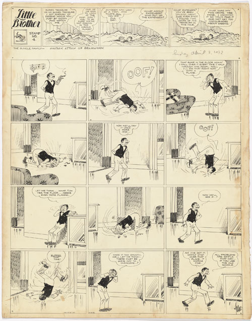
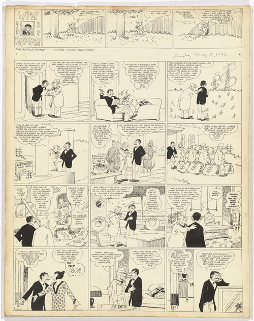
Click each for huge (2400 x 3000) but readable. All photos by Ricardo Blanc.
The Bungle Family, which ran from 1918 until 1945, was extremely popular in the 30s; basically, if your local paper didn't have Thimble Theatre (starring Popeye) on the front page of their comics section, they had the Bungle Family, and if they had neither, they were in trouble (Thimble Theatre was distributed by King Features, the Bungles by King rival the McNaughton Syndicate). Tuthill's work was so successful because he took the proven popularity of the family-centered comic strip (such as Sydney Smith's The Gumps) and combined it with, and even anticipated in the 20s, the new realism seen in features like Buck Rogers and Tarzan.
The Bungle Family themselves, lower-middle-class apartment dwellers, were totally unlikeable: they were ignorant, nosy, loud, buffoonish; they were everything readers were sure they themselves were not. The Bungles weren't lovably out-of-it like the families in Bringing Up Father or The Gumps. They were, however, realistic. They were the bad neighbors everybody had. Nobody wanted to live downstairs from this:
Yet the Bungle Family went through the same hardships everybody else was going through during the Depression (although they were luckier than many; dumb luck, to be sure). Yes, they schemed and plotted (ineptly), but were also prey to scammers and plotters themselves:
On a formal note, few cartoonists have matched Harry Tuthill in his mastery of the form. His line is thin and fluid; he manages to pack in plenty of detail without making his panels look crowded or overworked; he creates airy, coherent spaces with the confidence of an architect. He used solid blacks very sparingly (he's almost the anti-Chester Gould) but cunningly to emphasize the central figure in each scene (usually George Bungle), as can be seen especially well in the examples above and below. He also wasn't lazy: he eschewed assistants completely, and avoided labor-saving techniques like the use of halftone screens (Ben-Day/Zip-a-Tone) and lettering shortcuts (note that he redrew the "Little Brother" title with fresh lettering for each installment) until much later in his career. On the other hand, he also showed no interest in fanciful layouts or other gimmicks; note that all four strips on this page adhere strictly to a twelve-panel grid, a prison within which the artist thrived. It's easy to see why a formalist like Art Spiegelman admires Tuthill's work:
So why did The Bungle Family, so popular during its initial run, fade so quickly after Tuthill retired? Why did it sink into obscurity, its praises sung only by the most hopeless comic strip nerds (ahem!), while Popeye achieved immortality? First of all, despite George Bungle's frequent pratfalls, the strip was popular primarily with adults. The weekday strip consisted of long, complicated narrative continuities (not evident in these stand-alone Sunday pages) which I can't imagine were all that appealing to kids. Plus, as I pointed out before, the characters were totally unsympathetic, and because of this, the Bungles didn't get merchandised as toys or games or, like Popeye, made into animated cartoons. The strips also didn't lend themselves well to reprinting, as they were so filled with torrents of dialog in tiny lettering that reduction in size rendered them illegible. These factors, and perhaps Harry Tuthill's apparent lack of interest in promoting his own work, basically guaranteed that once the Bungles stopping running in the newspapers, they more or less stopped appearing anywhere.
That's a real shame, as in my opinion The Bungle Family is one of the great, epic achievements in American comics. I'd love for one of the reprint publishers (Fantagraphics? The Library of American Comics?) to republish the strip in its entirety (one measly year, 1928, was published in the 70s), but I'm not holding my breath.
You can see a fantastic selection of scanned color Sunday Bungles from 1937 here. Get into the Bungle Family!


6 comments:
I have to say that the drawing and especially the lettering is beautiful.
Thanks for this. I had not heard of this strip. I love the art, but couldn't read the text. You've got me intrigued with the idea of continuing story lines. (If you're interested, you can check out my work at the URL below.)
Brad
I should have said above.
Brad, just click on the images to view the larger, readable versions.
Thanks for posting these at large size. Love to see the linework and lettering, as Jim says...hard to believe it was done by hand, but you can see the strokes.
His lettering is INSANE.
Post a Comment