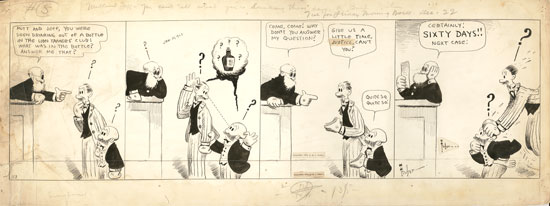
Click for lots bigger.
Above is the original artwork (pen/brush and ink with graphite on illustration board) for a Mutt and Jeff comic strip which was originally published by the Wheeler/Bell Syndicate on December 22, 1922. A noteworthy thing about this drawing is that it's HUGE, 11.25" x 30". Typically, drawings for daily strips are about 8" x 20", and I have no idea why M&J strips from this period were drawn so large; it's not like the drawings are particularly complicated, refined, or detailed.
Bud Fisher created A. Mutt (the feature's original title) in 1907, and it is generally regarded as being the first successful daily comic strip. Fisher became very, very rich thanks to Mutt and Jeff, but quickly lost interest in actually drawing it. By the time the above drawing was published, all the work was done by Billy Liverpool and Ed Mack (who probably drew this one), but that didn't stop Fisher, a notorious credit grabber, braggart and all-around asshole, from signing it! A good example of Fisher's hubris is that he liked to claim in interviews that he drew every frame of the 300-or-so M&J animated cartoons produced by the Barré Studio, an absolutely ludicrous and insulting claim which surely endeared him to the talented production artists who slaved away to make him even wealthier.
This drawing has been through some rough times (I'm sure its awkward size didn't help): it got bent up and mangled on the left and re-flattened, probably with an iron; it has moisture damage, and at some point in 1923 it was reformatted for publication elsewhere, hence the second pasted-on signature and copyright notice.
I love this strip, though. So many question marks! It features one of my favorite things, a vaudeville-style prohibition gag (a subject I always favor; I've got four or five other prohibition-themed strips from the 20s in my collection). The title of this episode, written in pencil at the top, is "You Can't Tell What You're Drinking These Days", and that's the key to the gag*: the judge asks what they were drinking, and hell if they know what sort of bathtub concoction it was. In the end, it's clear that Mutt and Jeff really need to work on their negotiating skills.
*Comic strips in the early days usually carried titles, a tradition which petered out and then was finally done away with when comics shrank in the 40s. Later, Bill Griffith revived the practice in Zippy the Pinhead.

11 comments:
I knew successful artists hired other people, like Al Capp hired Frank Frazetta, but I had no idea the practice started this early.
Also nice to know Bud Fisher was an asshole. He certainly was not alone among graphic artists.
Comic strip artists, especially daily artists, employed assistants almost from the start to do various chores, from simple things like filling in the blacks, erasing pencil lines and pasting on copyright notices and whiting-out mistakes, to more involved chores like lettering and full-on inking and even writing. Fisher is noteworthy for entirely turning over Mutt and Jeff to his assistants, because he simply couldn't be bothered. Supposedly the great George Herriman started out as one of Fisher's early assistants!
Later, the practice became so common that doing all the work yourself became a rarity. Bill Griffith, Charles Schulz, and Patrick McDonnell are examples of artists who did/do it all with no help.
Frank Frazetta always defended Al Capp, and insisted that Capp micromanaged the strip and always corrected and refined his own work. Capp himself started as an assistant on Joe Palooka.
Oh! I think Bud Fisher's assistants even had assistants! If you look closely at the bottom left of the board of this strip, you can see an instruction to an assistant: "erase pencil."
One of my favorite things about ZTP is the titles. Interesting to know that Griffith doesn't have assistants.
I LOVE your antique comic strip collection and your commentary on each of them. So enlightening!
Your comics stuff rocks.
When you right your book about these strips, you had better let me know. I need to buy it.
This bit of dirt on the dirtbag behind the panels is excellent. Seriously a book of history and your analysis of this stuff would be a great read.
Holy tap dancing bejeezus on a stick, I did not write "right" instead of "write".
Cat and I are fighting over the chair while I try to eat dinner and read your blog, it that is any kind of defense.
Something about all the question marks tickled me too. And the dotted-line eye connection.
The lettering is in a very loose style compared to other old strips, such as the Dick Tracy you showed a while back. Is that characteristic of older strips?
It depends on the artist, but earlier comics did tend to have looser lettering. A really interesting case is to look at Winsor McCay strips like "Little Nemo" and "Dreams of the Rarebit Fiend", and you'll see almost impossibly refined artwork combined with crummy word balloons and terrible lettering which almost seem like an afterthought.
Post a Comment