(Click for bigger.)
See, the two series have kind of switched places. I initially meant the hot dog pictures to be kind of arty, but as the series progressed, I found that I was really only interested in documenting the various paintings of hot dogs, without letting my aesthetic sense get too much in the way. So the first version of yesterday's hot dog was actually a better photograph, but the second version is a better document of the painting.
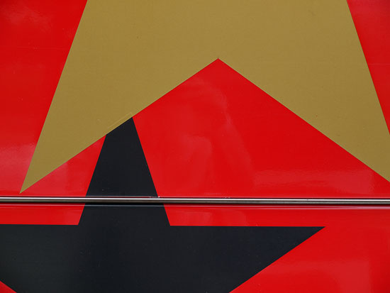
When I started the Ugly Tour Bus project, I was first interested in simply documenting the myriad hideous designs emblazoned on their sides, but eventually my artier side started to take over, and the photographs morphed into more of an attempt to "make a silk purse out of a sow's ear," and to make beautiful photographs using the ugly designs as raw material. With each new photograph, I got increasingly strict with the compositions. As the arrangements got more and more minimalistic, each element took on a greater importance, and finally I got to the point where I could no longer tolerate things like crooked lines and imperfect horizontals or verticals.
So in the first version of this bus, I didn't mind that the line between the panels was askew, but now I look at it and it bugs me, so I was really happy to tighten up the shot in today's photo.
So anyway, yes, I really do think about these things this way. I'm like this all the time! Sorry about that.

4 comments:
Wow. That so reminds me of this…
http://s.pixogs.com/image/R-1969656-1255775107.jpeg
Ha ha! Wow, damn!
Wow x2. I wonder if Duran Duran knows.
And I think arty-er bus pix just make more sense, because hot dogs seem like they're harder to paint. I mean, they're pretty ugly on their own. But as hard as they may be to paint, my god, the relish . . . the hideous, hideous relish . . .
I hope I don't get stuck with a ugly tour bus! My friends and I looked into a tour bus rental to travel cross country sight seeing!
Post a Comment