(Click for lots bigger.)
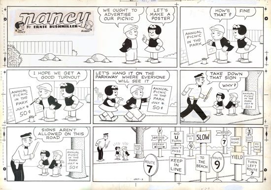
Like most hardcore Nancy fans, I'm not as impressed by the Sunday pages, but I had to get one, and this is an above-average example. Basically, Bushmiller's weekday strips were masterpieces of minimalist balance and tight gag structure, little vaudevillian Zen koans, so carefully constructed that they are absorbed by the brain before the eyes even have a chance to blink. The Sundays, however, are a little flabby, with too much setup for the final gag. You can see above that the bottom two panels would make a great stand-alone strip*, and everything above is pretty unnecessary (keeping in mind, to be fair, that the top row was designed to be drop-able). Furthermore, Bushmiller relied heavily on his assistants for the Sunday pages, making them even less "pure." Fantagraphics will not be including the Sunday pages in their forthcoming Nancy collections, and while unfortunate, it doesn't bother me all that much. All the same, these individual panels are well composed and the drawings are, of course, excellent. Note, too, that the first panel includes a strange double appearance of the mystical "three rocks."
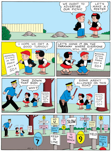
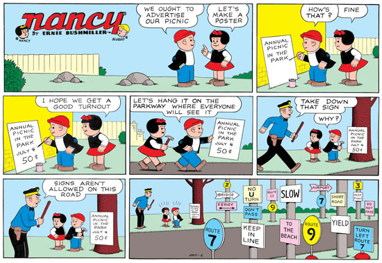
Just for fun, I decided to clean up the scan and make a color version of the strip. I used only those colors available to newspapers of the period, and referred to Sunday Nancy scans online as a guide. Otherwise, I tried to keep it simple and use Bushmiller's own compositional strategies** to place the colors in a harmonious, rhythmic way:
(Click for bigger)
*In fact, I have in my collection an unfinished drawing by Bushmiller for a weekday strip which was abandoned and then expanded into a Sunday page.
**Bushmiller was apparently not very involved in the coloring of the Sunday pages, and indeed, it's hard to imagine him caring much about anything other than black and white.
UPDATE: I was just thinking of other cartoonists whose work was way, way better on weekdays than on Sundays and vice versa. Better on weekdays: Dick Tracy, Alley Oop, For Better or For Worse, Terry and the Pirates, Dennis the Menace. Better on Sundays: Krazy Kat, Gasoline Alley, Gordo, Bloom County. Equally gifted in different ways at both: Calvin and Hobbes, Peanuts, Captain Easy, Li'l Abner, Mutts, Non Sequitur. Etc.!
UPDATE: To illustrate a point I made in the comments about how this page would likely be reformatted for comic book use:


11 comments:
"little flabby, with too much setup for the final gag."
Since I was a kid I presumed that it was conventional with Sunday funnies to design the first row of panels so that they could be excluded, giving the local paper latitude to make each strip two or three rows tall. I presumed this depended on the preferences of the local paper (and possibly reader input), and there may have been some cost differential for the paper depending on whether the first column was used.
These are presumptions I've held for a long time and never researched. I'm going off the fact that between the two Sunday papers from cities nearby where I grew up, certain strips would include the 'splash' row (title panel + 1-2 more panels) in one paper and not the other. The strips were more eye-catching with three rows but the content in the first column was generally superfluous expository stuff (like in this one) or a stand-alone (sometimes seasonal) gag.
Thanks as always for the Nancyphrenia, Peter. It always seemed old-fashioned to me as a kid, but there always seemed to be something more 'serious' about it too, like it was better in some ways than even Peanuts, and way better than many of the other long-time survivors like Hi & Lois or Hagar the Horrible (I reserve opinion on B.C. - that one always seemed like a little subversive pleasure to me for some reason).
I loved the linked quote about the "three rocks." It should be a go-to quote for anyone who needs minimalism explained. Brilliant.
Charles Schulz was probably the best at making the Sunday throwaway panels so good and seamless that it isn't obvious at all that they're disposable. Bushmiller's are always really obvious and redundant.
The difference in size with or without the throwaway panels is very simple: with the extra panels, it's a half-gage, without, it's one-third of a page.
In addition, the second panel is extra-disposable, in that you can format a comic book page by keeping the first panel in the top row, deleting the second panel, moving the fifth and sixth panels down to a third row, and placing the last panel/panels in a fourth row. Versatile!
Oh, and I hate to say it, but Art Spiegelman is totally wrong about Bushmiller's use of the sacred three rocks, because he also did two-rock and single rock groupings all the time. Spiegelman intimates that Bushmiller exclusively used the three-rock arrangement, but that simply isn't true.
I really admired Watterson for being an asshole and demanding that his Sunday comics run unaltered in half-page format. It made them SO much better.
Wow, Petey, you really have thought this out. Whatever you're on, I want some of it.
Very cool!
Do you hang your collection on the wall, or keep it in folders or whatever?
I keep them flat. I really should frame a couple of them, though, because india ink on bristol board are very stable materials.
Srsly. They would look fucken awesome and your visitors could enjoy, too.
I agree with almost all that you've opined in this column, but with the exception of the merciless slam of the Sunday Dick Tracy. Where else was a youngster be expected to find and collect the fine 'Crime Stopper's Textbook' installments?
It wasn't meant to be a "slam" on the Sunday Dick Tracy strips at all; I love them! It's just that in my opinion, the dailies were much stronger in every way.
Post a Comment