All the emails between me and Negativland are long gone, alas, but I can more or less go through the process from start to finish through the jpegs and Illustrator drawings I've scavenged from various hard drives and (LOL) Zip discs.
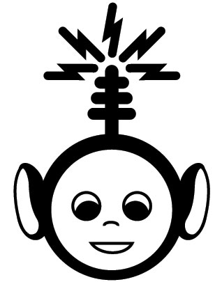
What I don't remember at all is how I got in touch with Negativland to begin with. It had something to do with this drawing I did in 1998, during the early height of the Teletubby craze, for a certain Pony Pal's pirate radio station in Tucson:
I think it was on some copyright infringement activist website that I showed somebody the Teletubby logo, and he said, "Oh, Negativland is working on something that involves the Teletubbies, so you should show that to them." Basically, after sending Negativland the image and examples of my other work, Mark Hosler, who ended up being the only person from the band I corresponded with throughout the entire process, more or less immediately asked me if I wanted to design the cover for their next EP, which he said was going to be a mashup of the Teletubbies, Chumbawamba, and excerpts from a classic text on anarchism. How could I say no? Before I knew it, I was in way, way over my head. Negativland was, at this point, slick; I was not.
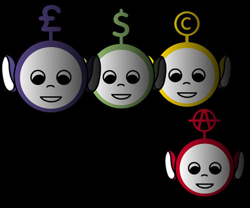
First I threw out some really rough ideas. I think Mark and I both came up with the four different symbols to put on the Teletubbies' head. This was the first (bad, cliché) idea:
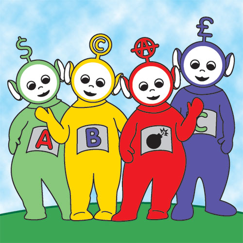
But then right after that, I came up with the one single image which would end up exactly the same at the end:
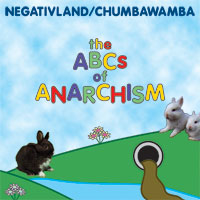
The plan was for this to be the image for the front cover of the CD, a single sheet with credits typeset on the back. Plain 'n' simple. That was easy!
Not so fast. I believe next the lawyer consulting Negativland on the project got a little nervous about putting such a blatant rip-off of the Teletubbies, all parody aside, right on the front cover of the album. We briefly toyed with the idea of changing their appearance more, such as giving them different colors. I came up with this gruesome pirate theme, for instance:
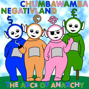
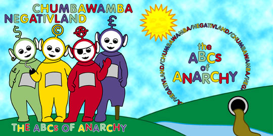
Note that I was already determined to use my all-time favorite typestyle: VAG Rounded. Mark then decided that rather than putting the Teletubby artwork on the front of a single sheet, that it would go on the back of a single-folded insert with a different image on the front. I decided a nice idea to do would be to have the typical Teletubby landscape (with the cutest sewage spill) continue onto the front, like so (still with the pirates!):
Stay tuned for part two, in which I finally start using the correct title, and then the work suddenly quadruples, and then octuples!
EDIT: In the comments, Comrade PhysioProf kindly points out the terribleness of the typography in these early examples. Um... I agree? That's why we ended up changing it. You can see above that I kept trying to come up with ways to put the two band names on equal footing, with neither coming "first." Mark Hosler ended up saying, "Look, I can tell what you're trying to do, and it's a nice idea, but just put us first; it's our record."
3 comments:
Dude, the typography is fucken horrible.
I know, I know. It gets a lot better. But that's the way this project went: at first I was supposed to just do a single illustration, but then they wanted me to do the typography, too, for which I was totally unprepared. Then, as you'll see, the project just kept expanding and expanding.
According to Wikipedia, Radio Limbo is still on the air. That according to a published report from 2004 which was a lie.
Post a Comment