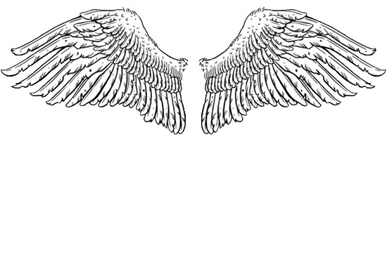
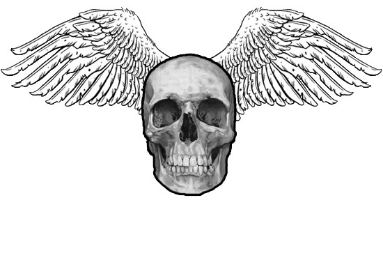
OK, you want to make an irritating t-shirt? First of all, it has to feature wings (THIS IS NOT OPTIONAL) and really should include a skull. Let's start with a pair of wings; it doesn't matter where you
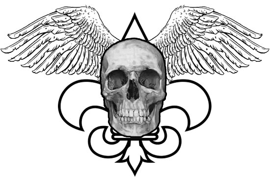
Next, you need to add some sort of element reminiscent of Rococo tracery or shapes found in fleur de lis motifs (resist the urge to use pseudo-Maori "tribal" elements; the 90s are over). I'm just going to dump in a simple example of the latter:
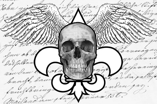
Now you need some more-or-less random crap in the background. I strongly urge you to use old-fashioned handwriting:
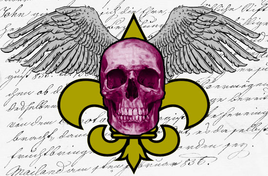
Now it's time to place your design. Here is a crucial point: even though you've just made a symmetrical work of "art," DO NOT place it in the center of the shirt. Make it look like the garment was just tossed haphazardly under the screens:
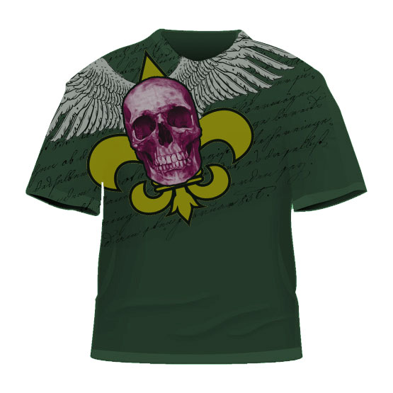
Not shown above, but crucial nonetheless: sandpaper your silkscreens a little to give them a totally phony "distressed" look.
Last step: contact the buyer at Nordstrom Rack.
Obviously, these are all suggestions (BUT NOT THE WINGS! THEY ARE REQUIRED!), and this is a highly-simplified example (not nearly enough random crap) but I'm sure you'll agree that the tutorial above will help you make a t-shirt so trendy, so incoherent and badly-considered, that you will be rolling in money in no time.
You're welcome.
UPDATE: After completing the above from memory, I thought I'd check Urban Outfitters to see if I could find a good example, and was astonished to find this meta-ironic version:
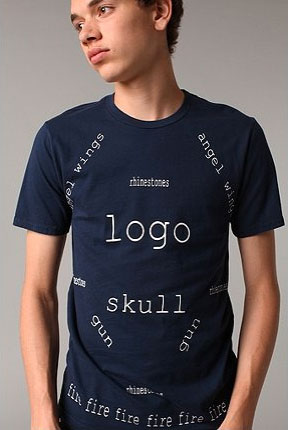
I swear I didn't see that before writing the tutorial. Points off for symmetrical placement, though.
UPDATE: I also didn't previously see this obnoxious Ecko design, which includes every single motif suggested above:
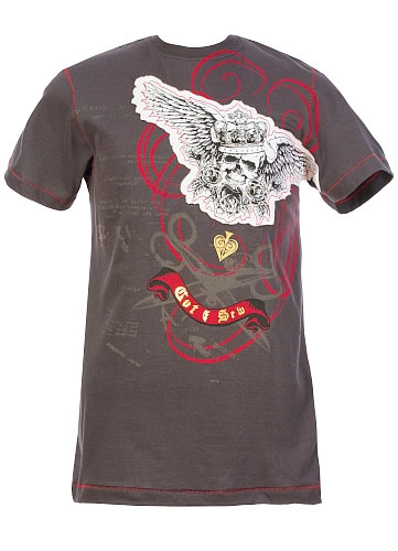
UPDATE: This is the kind of link I love:
Wil jij ook wel eens meedoen met de mode ?
Dan vindt je hier een pracht van een handleiding om je eigen coole trendy T-shirt te maken voor weinig !
Het is eenvoudig en makkelijk als je de stappen volgt. En niet te vergeten : Je bent echt de bom deze zomer in je eigen unieke shirt !
Laat je fantasie eens gaan over een mooi en eigentijds ontwerp !
It's funny because it's Dutch!
32 comments:
Great stuff.
In the punk rock days, circa late '70's a friend discovered a screen print shop in Detroit that sold shirts that had been used for test prints. They really did have designs printed as though the shirt was thrown under the screen at random. They also had several different unrelated designs printed on them. They cost around a dollar each. We bought a bunch of them. We refused to tell where we found them It was our little secret. Now that you mention it, one of them did have a skull with a lot of random crap but no wings.
Well, it was the 70s, after all. If you wanted wings, you had to get an Aerosmith shirt.
It's hard to find just the wings with no other crap.
Is there a name in the trade for these shit-tastic designs? I would love to know what they are "officially" called. All I know is I see them everywhere and they are so ugly and so OVER I would not be surprised if I started seeing them in pairs on vacationing elderly couples from the midwest. Who bought them on sale from a truck-stop while on an RV road trip.
On second thought, I think I HAVE seen them on vacationing elderly couples from the midwest. And Eastern European male tourists on Hollywood Boulevard.
Well, EVERYTHING at Ross Dress for less can't be perfect!
That is a masterful tutorial (WINGS ARE NOT OPTIONAL!) and your updates are meta-hilarious. Who ever thought the Hell's Angels would be so frighteningly influential for so many years?
Hey, you just gave me a great idea!
1. Go to GoodWill and scarf up as many of these types of shirts as possible that are in slightly tattered but still usable condition.
2. Wash them in a strong bleachy solution to fade them out a bit.
3. Make up a couple of random screens with elements as per your tutorial.
4. Apply liberally and naively until underlying design is adequately damaged.
5. Contact Nordstrom, etc.
6. Profit!
Good lord! I really don't get out enough any more! My contact with sullen youth exploited by textile capitalists has severely diminished over the last decade. I had no idea... but obviously many others do! Psychic spies have have already stolen your designs even before you made them! Always remember to spray some Espernot® in the sir after having really bad ideas lest they become stolen by the psychic minions of venture capitalists eager to make their millions the E-Z way by stealing your ideas!
Re: Meta-shirt youth
...And he looks so happy too!
Okay- this might be the best example of how your mind works.
Fabulous, just fabulous.
I loved it.
I have to try this...at last I can become famous
Anonymous, you are certainly right that this trend is really long in the tooth, or as Aunt Snow said above, "SO OVER." However, they're still clogging up the shops and I'm still seeing them every day, so evidence suggests that they are still, in fact, trendy. If you want further evidence, just look at the t-shirt displays at Nordstrom Rack: still as wingtastic as ever.
The meta-ironic version at Urban Outfitters shows, however, that this trend is just about over, so use the tutorial and cash in quickly!
I have the same question: is there a name for that formula? Because if there isn't, I propose WANO, for "Wings Are Not Optional."
And . . . did Alexander McQueen really inspire this? Because then I can maybe understand the taking-his-own-life thing.
But from what I can recall of his coture, these shirts resemble it in the same way that 80's spatter-painted Tees resembled Jackson Pollack.
Samael, no, not really, but McQueen did use skulls a lot (I've got one of his skull scarves).
Mostly I blame Ed Hardy.
That was absolute genius. Thanks.
I've been busy at work, so I'm late to this party. What everybody has said about genius? Ditto.
The only quibble is that the color you chose for the fleur de lis borders on copyright infringement of the New Orleans Saints logo, who use a slightly more washed out monkey puke yellow.
This is absolutely hilarious! It's the first blog post I've read of yours and I LOVE it. I am sick of seeing these dreadful things. Whatever happened to wearing a t-shirt that made sense?!
Thanks for the extra special mention :)
You probably knows what it says by now, allthough it's dutch. Your blog is inspiring en the T-shirt manual is absolutely awesome.
Kind Regards
Pelly
Nietnuttig.nl
I have shirts like this. Damn. I've been made a fool of; and I didn't even see it coming. This is the last time I let Express lead me astray.
I realize that the decision belongs to the blog owner alone, but this deserves to be a Greatest Hit or Glitteriest Moment. Comparing it to the Condi Photoshop Tutorial from five years ago, this is clearly the work of an evolved and confident artist.
This is one of the best articles i have read in a long time!!
I paint my own t-shirts with brushes and acrylic paints and you can be sure that I will take your advice to heart.
I would of course add some glittery stuff to it as well just to make my point =)
Krs
www.globalocalism.com
Brilliant!
And when is the stupid distressed image trend gonna die die die?
I found a cute T for my cutie nephew's birthday, but I bailed on it 'cause of that element. I guess the point really is to appeal to the adult who buys it, 'cause a ten year old sure don't.
Lame.
Add an image of the Virgin de Guadalupe in place of the skull and just tell me how much dough to send you.
Cafepress, anyone?
I sadly have to report that this is not the first time this trend has appeared. back in colonial Boston, there were literally hundreds of these:
http://www.rootsweb.ancestry.com/~rinewpor/cemeteries/ward05.jpg
UPDATE: My dad loves him some garage sales. This morning we had breakfast and he was wearing a baseball cap he picked up at a garage sale with a winged logo, fleur de lis and hard to read text asymmetrically placed on the front of the cap.
Maybe if 80 year old guys wear this, the young people will stop thinking it's cool. Here's hoping.
I'm a little puzzled: I was under the impression that the skull was mandatory, but the wings only strongly recommended.
I went shopping for children's shoes recently. They were all strongly gendered. All the girls' shoes included a lot of pink; almost all the boys' shoes had skulls. So did some of the socks; and, naturally, almost all the tee-shirts elsewhere. Also, most of the skulls were accompanied by daggers or revolvers.
This strikes me as somewhat inappropriate for small children.
Foolish Owl, never too young for a memento mori, I suppose.
I really do blame McQueen for the dominance of skulls these days. Even the new collection from Sparklefave Comme des Garcons, usually so iconoclastic, is chockablock with skulls.
You know, how creepy this is?
I read your post yesterday and THAT evening in the train home, i see this guy in train.
tshirt in a light beige, SKULL at about his left shoulder, beneath it the outline of a gothicy cross, some handwriting text going across from shoulder to shoulder
and on the backside of the shirt?
DIESELPUNK WINGS
and i have to see this horror right after you described it
I had the pleasure of being a few rows down from the Ed Hardy booth at the Vegas trade show this June.
ho-hum, all these things are now being produced in the more permanent medium of metal. they will last until someone take a blow torch to them.
This is hilarious and so true! I can't tell you how many times we get emailed by a "new line of clothing" containing this same crap! Now with the explosion of MMA, we are receiving the same designs but with titles like, "Ass Kicker," "Knuckle UP," "No Mercy" BLAH BLAH BLAH. Somebody do something original please!
this is the funniest thing i have ever read.
Great blog, laughed my a$$ off. I love the Urban Outfitters shirt pic at the end of the article. Anyone know where i can get my hands on one?
Post a Comment