(Image via Telegraph UK)
I enthused recently here about China's adorable mascot for their World Expo thingee, and now we have new spokesmodels to contemplate: those for the UK Olympics.
Yes, they are creepy and disturbing, but more importantly, they are a hot mess. This article at the Telegraph shows why: they have been pumped full of just too much meaning. OMG, it's like every part of them is significant, resulting in unholy chimaeras nobody will love.
Less is more, people.
UPDATE - This made me fondly remember bizarro cartoonist Mariscal's wonderful "Cobi" for the Barcelona Olympics.
16 comments:
Ah yes. There's nothing like design by committee! Especially design by government committee. Ever wonder why most state flags and seals stink?
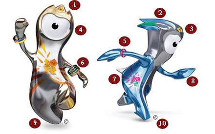
Adorable metallic cyclops wearing Lance Armstrong bracelets and a Woody Woodpecker topknot and a don't tickle me Elmo sharp little tail.
Hmmm.
The single eye represents focus.
The lack of a mouth represents the unspeakable awfulness.
The one on the left is mostly silver with a little gold and bronze, because putting in the effort to actually come in first place is a sign of unseemly pride in British culture. It's just not done.
And no discussion would be complete without bringing up the clumsiness of the 2012 Olympic logo.
Suddenly, Kokopelli looks appealing. No, no. That's not true.
Should M and W stand for Mario and Wario? Any good Nintendo gamer knows this.
I forgot about Cobi. He has two eyes a nose and a mouth, which is a big plus for me.
Striker was the mascot of the 1994 World Cup in the U.S. I bought several pins with Striker carrying large flags from the different competing countries. He looked a little like Augie Doggie, which is not a minus in my book.
http://upload.wikimedia.org/wikipedia/en/8/88/Usa94mascot.png
My favorite comment from the linked story is...
"So according to the much reported "shag bands" sported by the two, Wenlock offers; "Sex", "Oral Sex" and "Hugs" although the much more frigid Mandeville will only "Flash body parts"...
HA!
Considering how awful the logo design is, this isn't at all surprising. They kind of remind me of the Athens mascots, too, which were another pair of freaks.
I really loved the Vancouver mascots. They were all cartoony!
Wow, the Daleks have *really* been backsliding since the series reboot.
Glad to see they've taken exercise to get back into some kind of shape.
I was in the middle of the Salt Lake City Olympics in 2002 (the University of Utah was ground zero total security--we're talking steely eyed guys with machine guns-zone). The mascots then were Powder, a snowshoe hare, Copper, a coyote, and Coal, a black bear, as seen below:
http://en.beijing2008.cn/spirit/symbols/mascots/n214068252.shtml
Some wag at the time said they should have all had cross hairs on them because they are all legal to murder in Utah.
Looks like someone started with a bottle-opener, then added significance 1 through 10.
Which is it to be?
"Fight the power!"
Or?
"No! Run away. Run away."
Winge-y Brits.
Princess, did you see the YouTube videos?
Shudder.
Given Wenlock and Mandeville, I get to Forelock and Mandible, and from there you have soooo many options.
I immediately thought of Futurama's Lela.
"They are intended to represent focus, and also resemble the cameras through which the public will view and record the tournament."
Not to mention the security cameras all over London which will be watching your each and every move.
Post a Comment