Click for bigger!
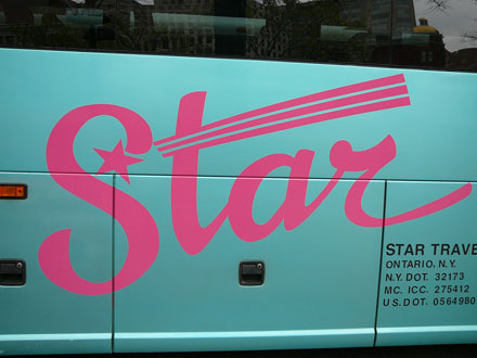
Yay! It's getting to be that time again when fleets of hideous vehicles with pointless swooshes, misguided appropriations of spiky tattoo designs and horrible type styles pour into the District. The bus above appealed to me for two reasons: its awful combination of colors and the inclusion not only of a star, but the word "star" itself! Oh, ugly tour busses, I totally heart you.
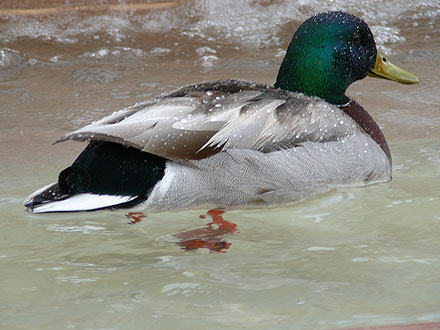
And here's your bonus duck in a fountain:


6 comments:
That Star Cruiser logo looks to me like the last graphic design done by the late Anna Nicole Smith and her production artist Bobby Trendy.
P.S. The duck looks very pleased with himself. Look at that smile!
And note how the water beads. That is one clean duck. You could eat your breakfast off its back.
I love ducks. I raised mallards when I was a child.
The best part of the photo is the clear view of the duck's webbed foot in the water. You can just imagine the underwater swooooshsss sound as he paddles by...pure genius!!
I saw this bus today! It was full of blue-haired old ladies with southern accents. Hell, some of them might even be relatives.
Post a Comment