(Click for bigger.)
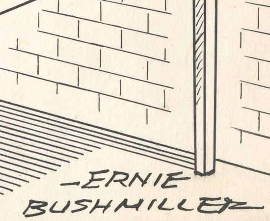
"My name is Ernie Bushmiller, king of comic strip artists," this drawing shouts. "Look on my works, ye Mighty, and despair!"
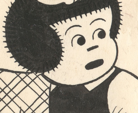
Despite its somewhat battered condition, this new acquisition is instantly my favorite Bushmiller. The final panel is such a tour de force of technical and compositional mastery that it practically hurts to look at it. As I've said before, original Nancy drawings from the 50s are scarce, so this was a lucky get.
Questions for discussion:
- Which panel do you think Bushmiller conceived/drew first?
- Are the first two panels useless space fillers? Why or why not?
- Why didn't Bushmiller use Benday/Zip-a-Tone for the table's shadow? Was he insane or just fastidious?
Some details:

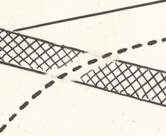
The detail above just kills me; it's the only scraping/correction in the entire drawing. Viewed so close, it doesn't seem to make any sense, but graphically it's ingenious and crucial for clarity.


9 comments:
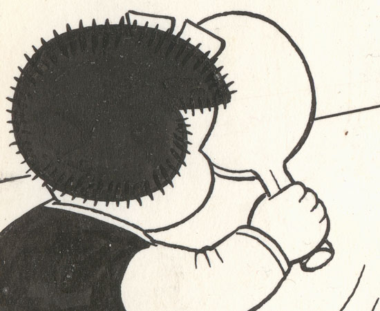
The hair bumps reveal their iceberg nature. I've NEVER seen anyone achieve that perfection when copying this feature.
The only cartoonist I've seen approach Bushmiller's style with any kind of credibility is Kaz in his "Underworld" strip.
Even I will admit that this strip is conceptually GENIUS. Never mind the draftsmanship!
Take THAT, Gallery on Baum!
1. Third panel.
2. Useful only for context. They may have been added because it would have been outside of Nancy's character to play alone. Sluggo is always her b*tch.
3. Shadow = OCD!
You're wrong about #2! The first two panels give the strip a narrative construct, and also delay (and therefore emphasize) the impact of the gag. Also look at how the positioning of Nancy in the first two panels lead the eye inexorably towards the gag. The positioning of Nancy's arms is particularly crucial and clever.
Ahh yes I see that now!
While I think he drew the last panel first, that first panel may have haunted him for a while, had he drawn it first. What is the alluring Fritzi doing behind the curtain in a darkened room?
The first two panels are necessary to set up the psychology of the gag. In the first panel, the look on Nancy's face indicates that she knows she's been bad and is unlikely to be allowed out to play. In the second panel, she is even less hopeful about her "plan B". Only with that context can you make sense of her contentment in the third panel.
And yeah, Kaz is a genius. Too bad he hasn't posted a new strip since February.
Post a Comment