Click for bigger.
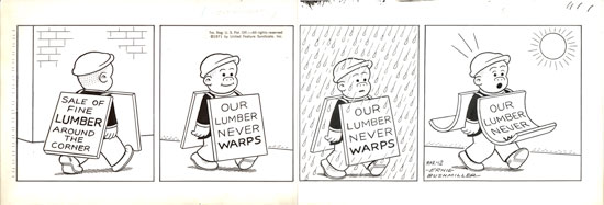
This is the original drawing (pen/brush and ink on Bristol board, 7" x 20.5") by Ernie Bushmiller for the "Nancy" strip which was published in newspapers on March 12, 1971.
I'm not sure what to say about this one other than to suggest that you gaze upon its utter perfection. This is a typically minimalist late Bushmiller strip; it doesn't even have any word balloons! I love, too, the very subtle up-and-down placement of Sluggo within the frame, which gives this strip a nice rhythm, and the gag is, of course, executed flawlessly.
I have several other Bushmiller originals (see one from 26 years earlier here), but I'm withholding most of them until Pony Pal™ Mark's sure-to-be authoritative How to Read Nancy is published later this year.

7 comments:
It looks to me like he just freehanded the ink, I usually expect to see a little pencil work. I do love the flow from one frame to the other. I also note that the third frame is the darkest, and that reminds me of Doonesbury, and how much all his strips were looking the same (haven't seen a Doonesbury strip in years, to be honest!) with the third of four panels nearly always a silhouette. I haven't looked at a lot of Nancy strips as closely as I look at them now, but I don't believe Bushmiller would ever get that formulaic.
Until you started posting these strips and talking about them, Peter, I never realized how sophisticated Nancy was.
Har Har! Who doesn't like a thin innuendo about wood dysfunction!
Thank you for educating me (and perhaps others) about this strip, which as a kid I thought was not very interesting. It'd be nice to see a photo showing an entire board, with the edges, etc.
jg, the picture here shows the artwork cropped to the edges. You can see, for instance, where Bushmiller "tipped" his pen at the top edge.
Love this historical stuff and your commentary Peteykins. I hadn't consciously noted the up and down placement, just that there was a rhythm to the panels.
(I am pretty sure 'wink, wink, nod, nod wood dysfunction' wasn't the subtext, but okay, I could be wrong.)
I'm going through withdrawals each time until you post something new...pand, sigh...
It's amazing how much three-dimensional spatial geometry he gets out of such sparse linework. He clearly had extraordinarily well-developed intuitions about human visual information processing.
Post a Comment