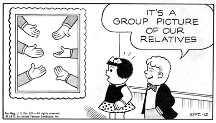
This panel shows an aspect of Ernie Bushmiller's genius: his mastery of black/white balance. He usually sticks to a strict black and white approach, using Zip-a-Tone™ very sparingly for grays. Notice here, though, that if he had used black for the sleeves in the picture, it would have overbalanced the characters. Instead, he used the screen dots for gray, balancing it with Rollo's slacks. Nancy and Sluggo really is like architecture.
2 comments:
Are the relatives sticking their hands out for money? Or are they offering their hands out to assist others? Or are they all offering hand jobs?
Ask Ernie of you talk to him.
..if you talk to him.
Post a Comment