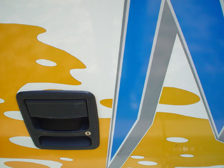
Why do they do it? I guess it's in a bus company's best interests to be distinctive, first so that they are easily identifiable for their toddler-like clients, and second... well, why? So that they look more fabulous than their competitors? Why, why, why are such Baroque excesses desireable? Are bored painters to blame? What kind of 1980s nightmare was the designer of this particular paint job trapped in?
Click the image for a huge, hi-res version.
No comments:
Post a Comment